Bakery Packaging for a nationally recognised bakery brand
When Food Connections wanted to refresh their range of bakery and snack products, they turned to Goulding Media to develop a brand identity that deliver the flexibility for decades of growth. From recreating their brand mark to crafting a flexible packaging system, we helped bring their vision to life, ensuring consistency across dozens of products, categories, and formats.
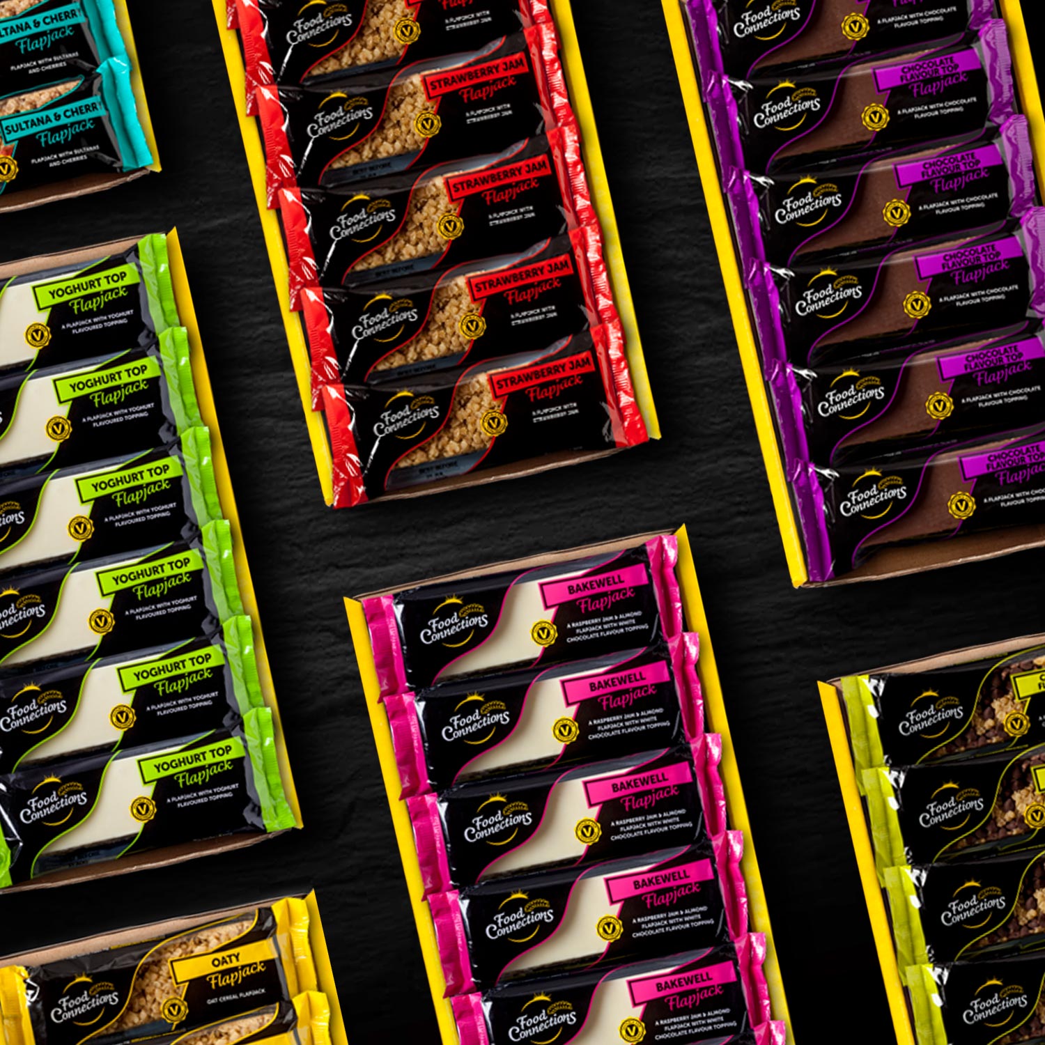
A Bold New Identity for Food Connections
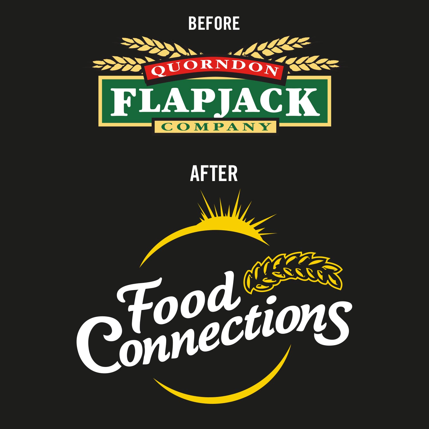
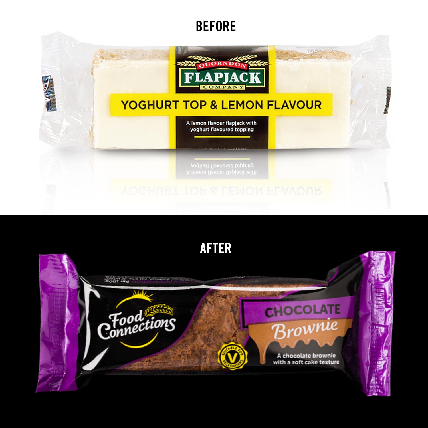
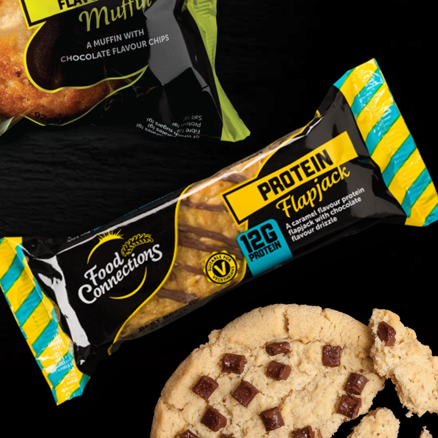
Food Connections started with a simple goal: to bring delicious bakery and snack products to more customers while maintaining a unified, recognisable brand identity. Originally known as Quordon, they recognised the need for a refreshed brand that would connect with a wider audience and allow room for future growth. That’s where our work began—we helped them transition to the name “Food Connections” and created a brand style that would be versatile enough to support an ever expanding product line. From bakery packaging for flapjacks to eye-catching cookie boxes, each product would reflect the same quality and cohesiveness that customers could easily identify.
Crafting a Flexible and Scalable Packaging Architecture
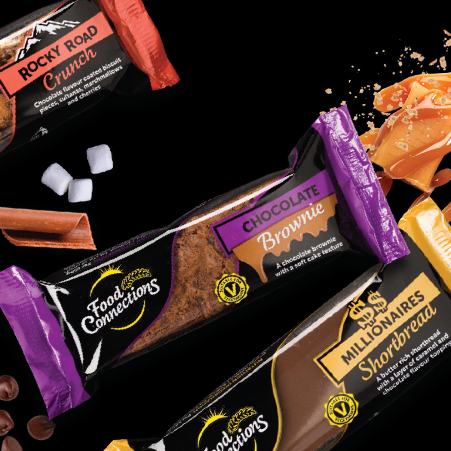
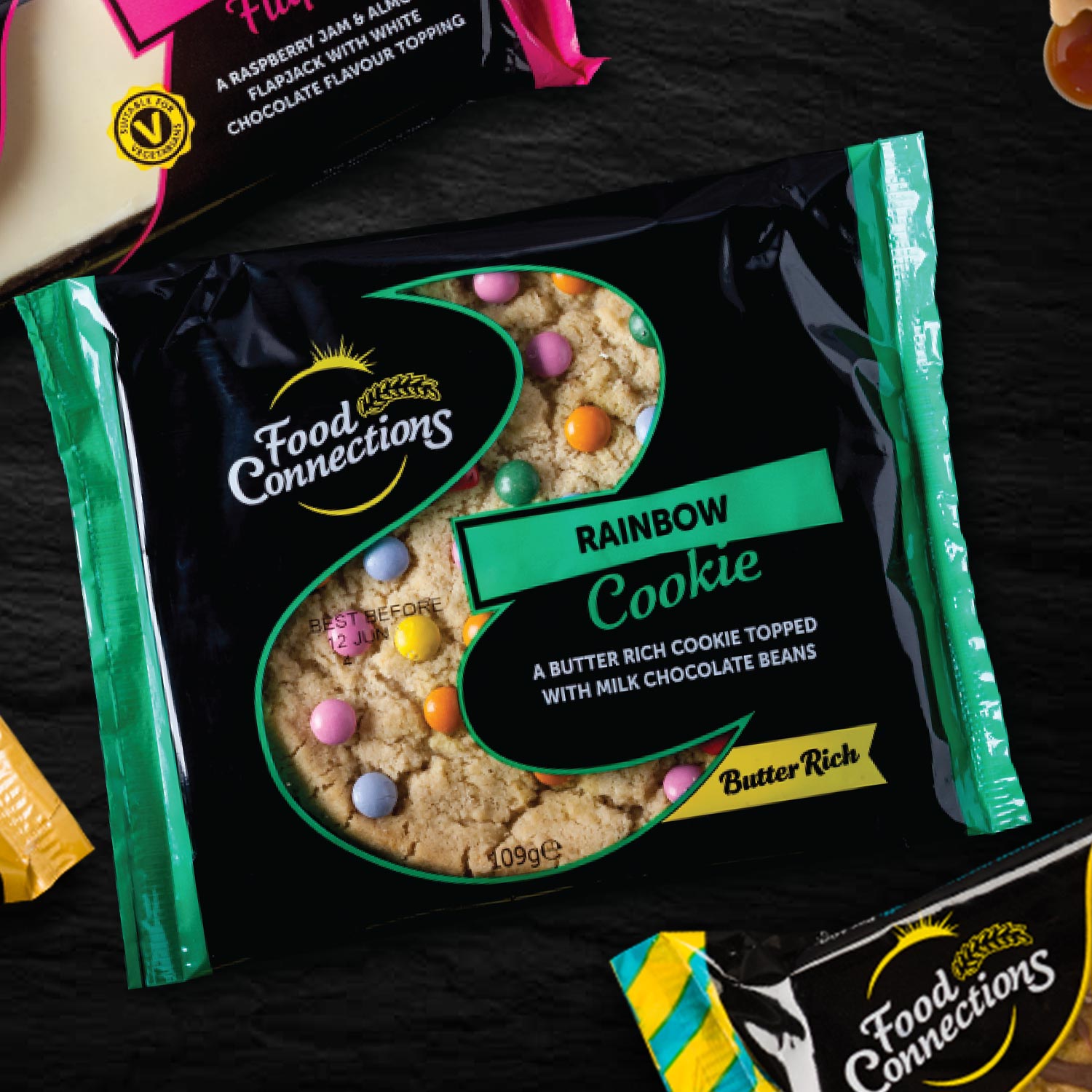
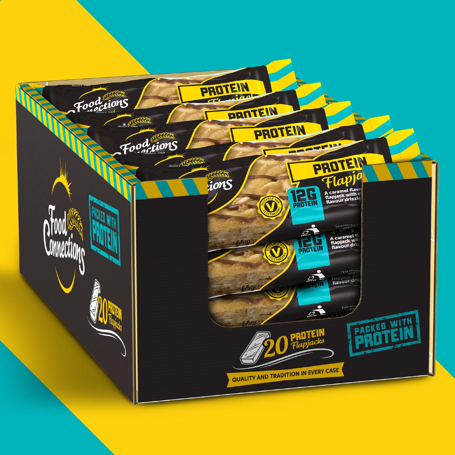
With more than 50 products in their lineup, ranging from flapjack packaging to protein bars and cookies, the challenge was to develop a packaging architecture that could be consistent yet flexible. We designed a unified packaging system that could seamlessly adapt to different shapes, sizes, and product types, allowing Food Connections to roll out new items without losing the brand’s cohesive look. From custom printed flapjack boxes to branded cookie packaging, each item maintained the same distinct Food Connections feel, no matter the size or type of bakery packaging.
This scalable approach also extended to shelf-ready packaging and labels, making the brand’s products easy to identify on shelves, no matter the retailer or location. This consistent look has not only reinforced their brand identity but also allowed Food Connections to build trust with their customers over time.
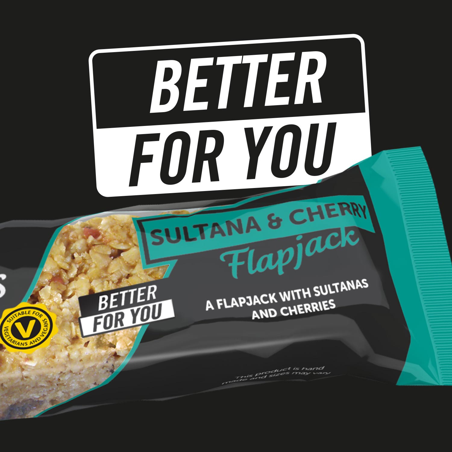
Adapting to Market Needs: Launching HFSS-Compliant Products
As Food Connections continued to expand, they wanted to align with health-conscious consumer trends by introducing an HFSS-compliant range. We took the existing brand style and adapted it for their new, HFSS-compliant flapjacks, creating a distinct yet familiar look for this healthier option. This project not only enhanced Food Connections’ appeal to a wider market but also demonstrated the flexibility of their branding to keep pace with industry changes and customer needs.
Our journey with Food Connections is a testament to the power of adaptable branding, allowing them to roll out innovative products like the HFSS range without compromising their brand’s identity. Food Connections now has some of the most recognisable bakery packaging in their market.
Explore more of our work or reach out using the form below to see how we can help your brand grow with cohesive, flexible bakery packaging. Discover more about Food Connections’ HFSS-compliant range in Asian Trader and In-Bakery.