Your pack carries 4.6 seconds of information into a 1.9-second look
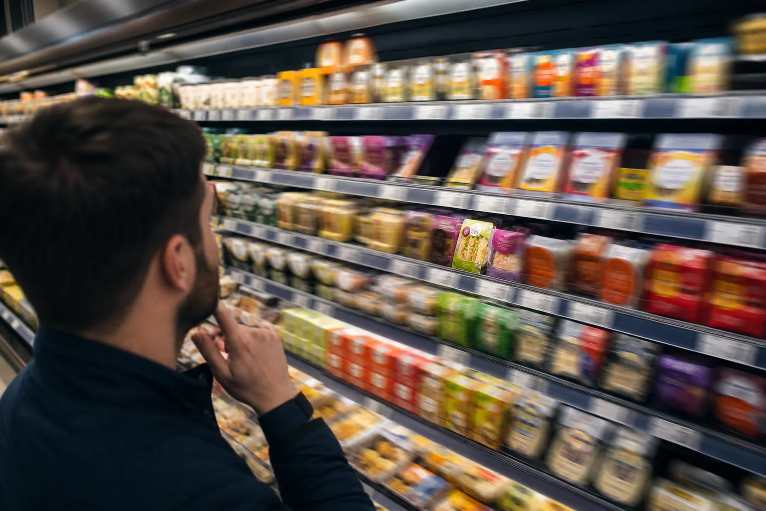
Your front-of-pack is built to be read for about four and a half seconds. The shopper gives it under two.
Eye-tracking work from Explorer Research puts the average glance at a pack at roughly 1.9 seconds. The same research finds the average pack carries about seven front-of-pack elements, which take closer to 4.6 seconds to actually take in. (Worth saying: the underlying sample, category and country behind those figures aren't published, so treat them as a strong directional signal, not a physical law.)
The gap is the problem. You've loaded the pack with more than the first look can hold, and the shopper decides where to spend their attention long before they've read any of it.
Be clear about what that first window is and isn't. Those 1.9 seconds are the initial attention window, the moment the eye lands and decides whether to stay. They are not the full purchase decision. Nobody chooses your product in under two seconds. What happens in that window is narrower and more brutal: the pack either earns a second look, or it drops out of consideration before the shopper has consciously judged it.
That reframe changes what you're designing for. The pack doesn't have to sell in two seconds. It has to survive them.
This is where the commercial stakes sit for you. A buyer questioning whether your pack "earns its place" on fixture is, without using the language, questioning whether it wins that first look against sharper neighbours. Lose the look often enough and you lose the rate of sale that defends the listing.
The job in the first two seconds isn't to close. It's to be worth looking at twice.
What the eye sorts before the shopper has decided anything
The first thing a shopper does at fixture isn't choose. It's filter. The eye sorts the shelf into packs worth a closer look and packs it skips, and it does that sorting on raw visual signals before any conscious preference kicks in.
That's the useful part of the saliency research. A 2012 study in the Journal of Consumer Psychology found that at rapid decision speeds, relative visual saliency can bias which product a person chooses, and under time pressure or weak preference it can sway the choice more than what the shopper actually prefers. Contrast, shape and edges do the early work. Claims and copy come later, if they come at all.
Two things follow for you.
First, a second look is not a sale. Winning the initial attention window gets your pack into the shopper's consideration set. Whether it converts depends on recognition, relevance and trust, which are decided in the longer read, when the shopper is holding the pack or standing in front of it. The pack earns the next look. The shopper still has to be persuaded after that.
Second, saliency matters most exactly where you sit. The same research notes that strong brand loyalty can insulate familiar names from these effects. The market leader gets found because shoppers already look for it. A challenger without that reflex is far more exposed to being filtered out on visual grounds alone.
Your pack's first job is to survive the filter, not to win the argument.
This is the mechanism under the buyer's question about whether your pack "earns its place." A pack that loses the filter never gets the second look, never builds the rate of sale, and hands the range reviewer a clean reason to delist it.
Standout is relative to the packs either side of yours
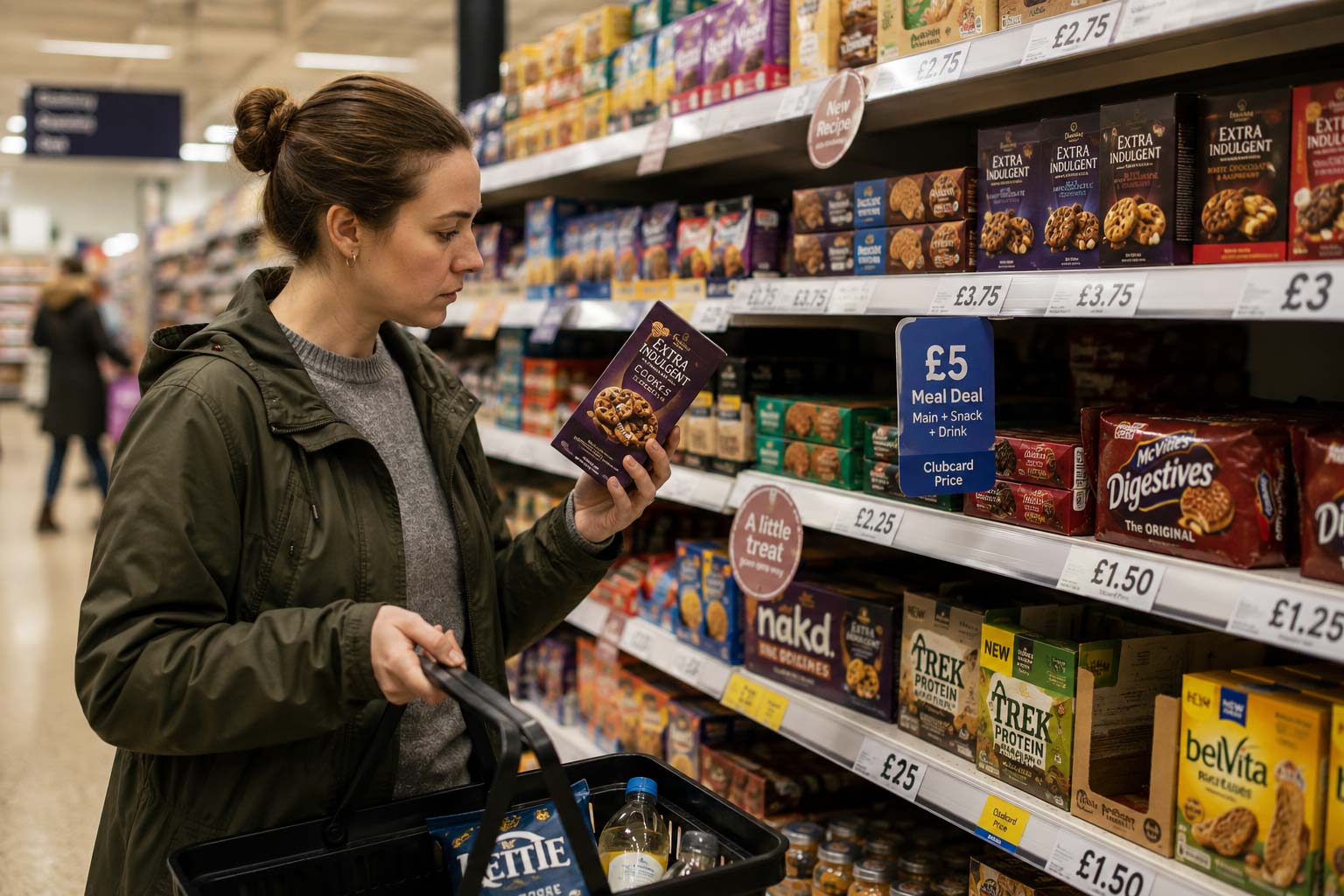
Your pack never gets judged on its own. The shopper sees it inside a bay of competitors, and the eye measures it against whatever sits next to it. A pack that looks sharp in a boardroom mock-up can vanish on fixture if its neighbours are shouting louder.
Eye-tracking work at a candy-and-gum checkout fixture made this concrete. Peanut M&M's came out as the strongest performer for both overall visibility and speed of noting, and the reported reason was blunt: yellow packaging and a strong logo cutting against a sea of predominantly brown packs. Contrast against the neighbours did the work, not attractiveness in isolation.
The same study showed how much position and facings move the numbers. For 3 Musketeers, going from one facing to two lifted overall visibility from 11% to 22%, and visibility within the first two seconds from 2% to 11%. A third facing pushed overall visibility to 31% but added nothing to that first-two-second figure, so the early-noticing gain flattened. Shelf height mattered too: products on the middle three shelves were noted by roughly 50 to 60% of shoppers, against around 30% on the bottom shelf.
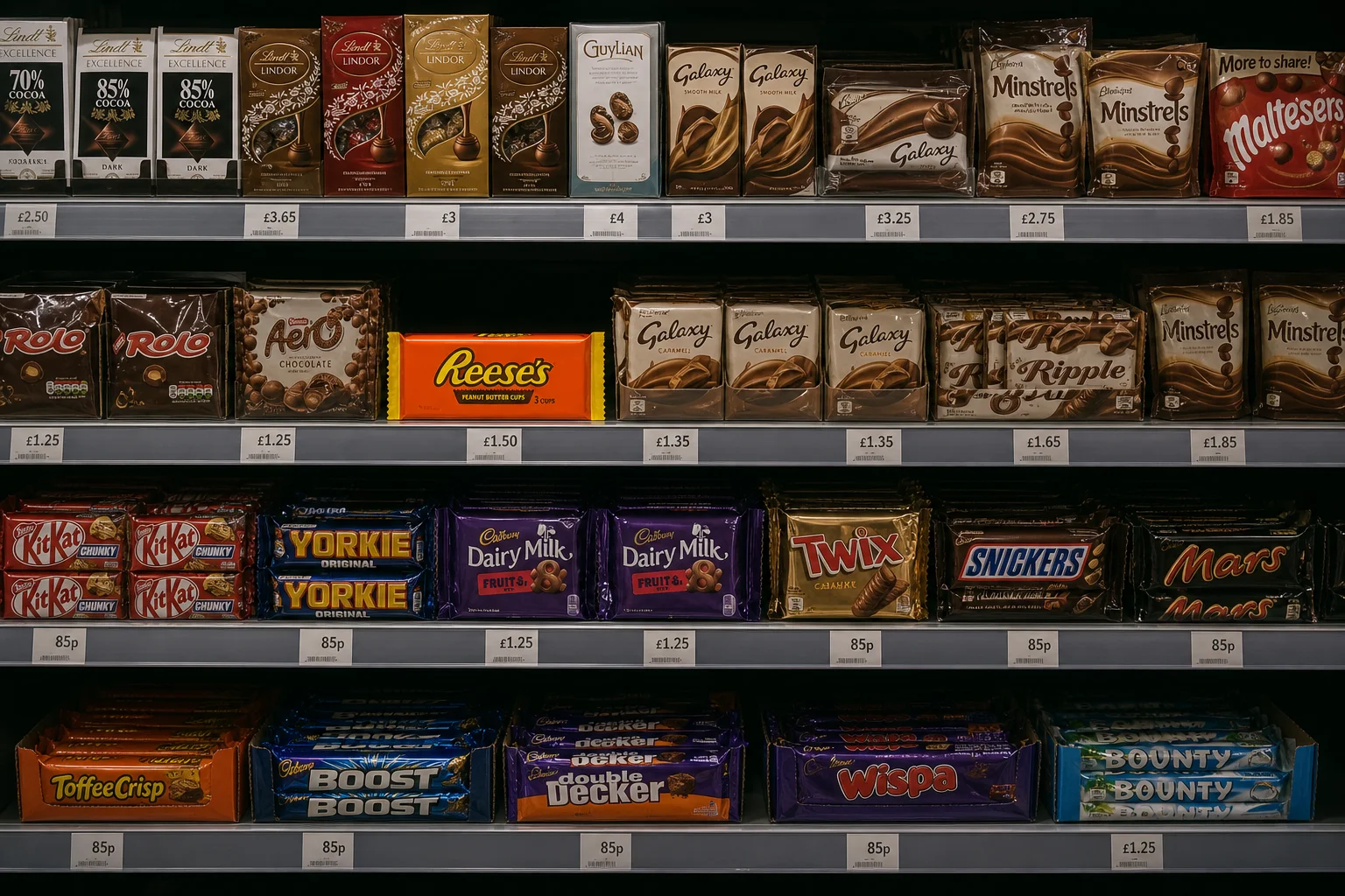
For you, this reframes the whole standout question. You are not designing against a white background or against your old pack. You are designing against the specific challengers sharing your bay, often with more facings and better positions than you hold.
That is also the buyer's eye. When a range reviewer scans the fixture, your pack is measured against its neighbours in the same glance, and the ones it loses to are usually the sharper challengers gaining ground on you.
What clearer hierarchy did to a salad brand's numbers
Fixing the order the eye travels in has a measurable effect, and there is a case with the numbers attached.
A ready-made salad brand rebuilt its pack around a clearer, funnel-shaped hierarchy, guiding the eye from the brand mark to the key product information and then down to the detail. The original had the information scattered, so shoppers had to scan most of the pack to work out what they were looking at, and the brand itself had weak prominence.
The eye-tracking study run by Tobii and Stratégir measured the difference three ways.
The share of participants who actually noticed the brand rose from 28% on the old pack to 44% on the new one. Time to first fixation on the brand halved. And the range carrying the new packaging was associated with a 15% sales increase.
Worth being precise about that last figure. The 15% is a reported case-study outcome, not proof that hierarchy alone drove it. The study doesn't publish sample size, retailer context, or a controlled analysis isolating the pack change from everything else moving in that period. Treat it as a real result in one commercial case, not a forecast you can bank.
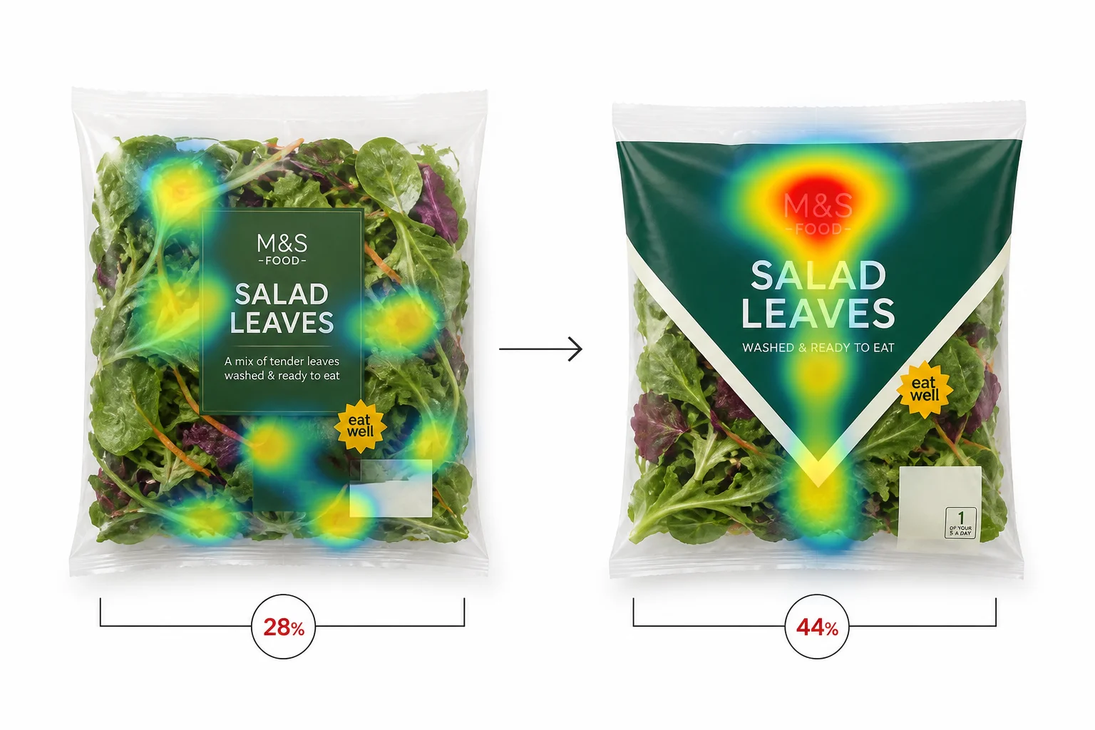
The visibility and fixation numbers are the ones a buyer will find hardest to argue with, because they measure the thing the shelf actually rewards: being seen, and being seen first. Going from 28% to 44% means nearly six in ten shoppers still missed the brand on the old pack. That is the gap a range reviewer sees before they see anything about your product.
When Tropicana redesigned the recognition out of its own pack
Tropicana ran the experiment nobody wants to run: a well-funded redesign that broke the cues shoppers used to find the product, and a sales curve that showed exactly what that cost.
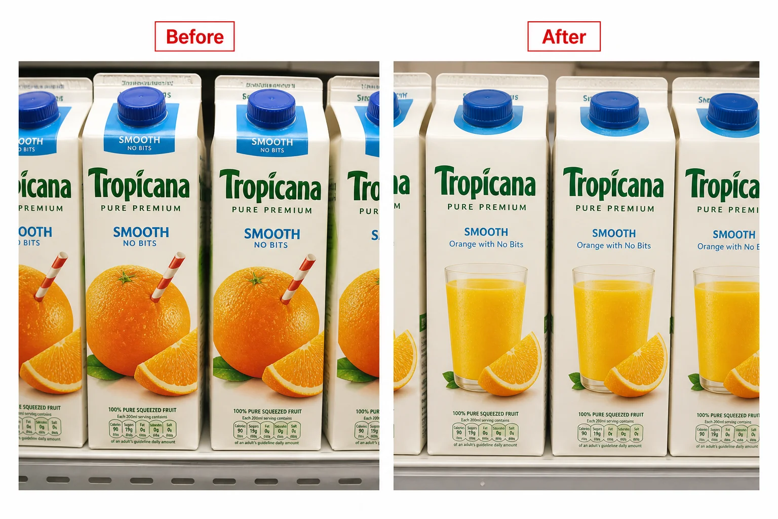
In 2009, Pure Premium dropped the familiar orange-with-a-straw image for a plain glass of juice, and switched the logo to run vertically down the side. The academic analysis of the change links the new packaging and marketing to a roughly 20% fall in Pure Premium sales and an estimated $27 million in lost revenue.
Two things went wrong, and they are the two things this whole piece has been circling.
First, findability. The straw-in-an-orange was the cue shoppers scanned for. Take it away and the pack reads, in the authors' words, as bland and close to a private-label carton, which weakens the shopper's ability to identify it as Tropicana at all. That is the initial attention window failing. Regular buyers walked the fixture and did not register their own brand.
Second, hierarchy across the range. The redesign used orange consistently across every variant, so the distinctions between the product lines went flat. A shopper reaching for a specific one now had to stop and read, in a moment built for glancing.
Strip out the cue people use to find you, and you don't just lose new shoppers. You lose the ones already looking for you.
The causal nuance matters here, and the researchers are careful about it. The study evaluates a broader marketing intervention, packaging plus other changes, not packaging in isolation. It used Nielsen grocery data and controlled for prices, competitor prices, promotions and seasonality, which is more rigour than most shelf claims carry. So the 20% is a real, measured decline attributable to the intervention, not proof that the carton alone did all of it.
For Dave, that is the point that should sit uncomfortably. This was not a small brand with a bad brief. It was a category leader with budget, and the redesign still removed the thing that made the pack findable. The fear of the wrong agency is rational. The costly mistake is rarely ugly design. It is confident design that quietly deletes a recognition cue nobody flagged as load-bearing until sales moved.
Tropicana reverted within weeks. Most challenger brands would not survive a 20% dip long enough to reverse it, because the range review lands first.
Colour tells shoppers it's you. It rarely tells them which one
Colour is doing less work at variant level than most founders assume. It anchors the brand. It struggles to explain the flavour.
The Ehrenberg-Bass study of colour and image cues audited 576 products across 80 brands and surveyed 1,853 US category buyers. Brands lean hard on colour conventions: across 25 variant types, 84% had an on-pack colour prototype, appearing on around 80% of products in that variant group.
Shoppers don't read those conventions as reliably. Consumers associated a particular colour with only about 56% of variant types, and brand practice matched consumer expectation in just 16% of cases.
Imagery carried the load instead. The study found significant, unique image links for 92% of variants. The practical takeaway is the one Dave can apply this week: use colour for brand and range recognition, but don't ask colour alone to tell the shopper which SKU they're holding. Show the thing.
That's the trap in a tidy colour-blocked range. It looks disciplined in the artwork review and blurs on fixture, where a shopper reaching for one specific variant has to stop and read in a moment built for glancing. The same failure that hurt Tropicana across its line.
TRIBE's 2024 redesign is worth noting as context, not proof. The Outlaw-led work was undertaken to win more listings and support an ambitious revenue goal, and the DBA case reports strong value sales and distribution growth alongside it.
Read that carefully. Distribution growth means more shelves selling the product, which moves sales on its own, before you credit the artwork. Packaging plausibly helped. It cannot be isolated as the sole cause when listings, promotion and NPD all moved at the same time.
Three jobs a pack does, at three different distances
The useful way to audit your own pack is to stop judging it flat on a screen and judge it against the task the shopper is doing at each point of approach. That sequence is better supported by the evidence than any fixed set of distances or a universal timer, so treat the distances below as working heuristics, not laws. The closest documented precedent is PRS IN VIVO's 6-3-1 model.
Three jobs, in order:
|
Stage |
Where |
Shopper's task |
What the pack has to do |
|---|---|---|---|
|
Be found |
Far range, roughly 10m |
Locating the category and a brand block |
Register through colour, contrast, silhouette and imagery before any label is readable |
|
Be understood |
Mid range, arm's length |
Asking "is this for me, and which one" |
Make product type, brand, variant and one key benefit clear fast |
|
Be believed |
In hand |
Verifying and comparing |
Carry the ingredients, provenance, certifications and quality cues that justify the pick-up |
Colour is absorbed first, then shape, then typography and detail, which is why a pack can win the far-range job and still fail the mid-range one. Plenty of ranges get found and never get understood, because the variant cue only resolves once the shopper is already holding it.
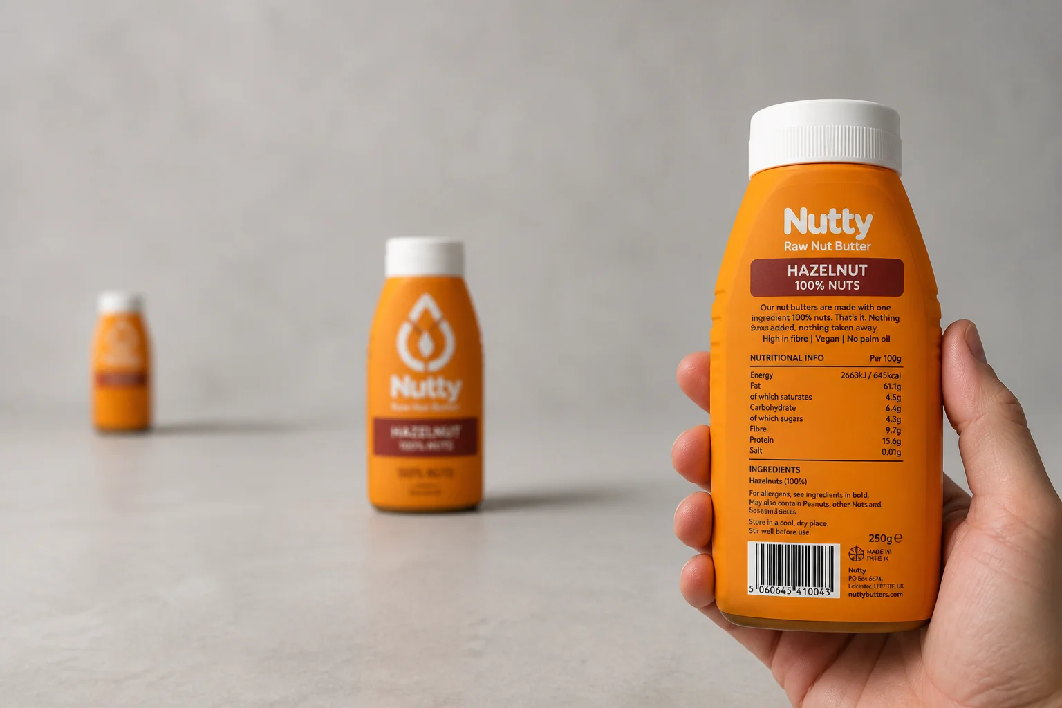
Run your own pack through the three rows and be honest about where it breaks. Most founders find they are strong on "be believed", where the back-of-pack detail lives, and weakest on "be found", which is the row that decides whether the shopper ever reaches the other two.
A test you can run this week for the price of a printout
Before you sign off any redesign budget, run this. It costs a morning and a colour printout.
Photograph your pack on the actual fixture, sitting next to the competitors it fights. Not a render on white. The pack competes against a bay, not a blank background, so the test has to reflect that.
Show that image to five to ten people who are not in your business and not close to the brand. Flash it for a short exposure, a second or two, then take it away.
Ask three things straight away, before any discussion: what brand was that, what product or category, and what one thing stood out. Then show the full bay and ask them to point to your pack.
Record the first reaction, not the tidied-up opinion after they've had a think. Group discussion contaminates the very thing you're measuring.
Read it simply. If most people can't name the brand and category within a few seconds, or the "what stood out" answers come back scattered and wrong, you have a recognition and hierarchy problem. The purpose here isn't to prove the pack sells in two seconds. It's to see whether it survives the first filter and earns the closer look.
That distinction is the whole point. A pack that fails this test is losing the shopper before price, taste or provenance ever get a vote.
It's also the question sitting behind a buyer asking whether your pack still earns its place in the range. A listing is shelf space they could give to someone sharper. The test tells you, cheaply, whether your pack is defending that space or quietly handing it over.
Sources
- How To Get The Most Out Of Your Packaging – Explorer Research — Explorer Research
- Relative visual saliency differences induce sizable bias in consumer choice — Journal of Consumer Psychology
- Unseen is Unsold — Packaging Strategies
- How to Improve Package Design with Eye Tracking – Tobii — Tobii
- A study of the impact of package changes on orange juice demand — Journal of Retailing and Consumer Services
- How to signal product variety on pack: an investigation of color and image cues — International Journal of Market Research / Newswise
- TRIBE undergoes major redesign to achieve ambitious 2027 goal by Outlaw — World Brand Design Society
- TRIBE: Redesign — WARC
- Creating a Framework to Win in the Aisle — Packaging Strategies
- FMCG packaging design: what the brain sees in 2 seconds — BroHouse
- 7 Strategies for Powerful Packaging Design – part 1 | 2016-09-07 | Brand Packaging | Packaging Strategies — Packaging Strategies
- Packaging research – evaluating consumer reaction — Quirk's Marketing Research Review
- Packaging Design for Shelf Visibility: The Complete Guide to Standing Out in Retail — Confetti Design Studio