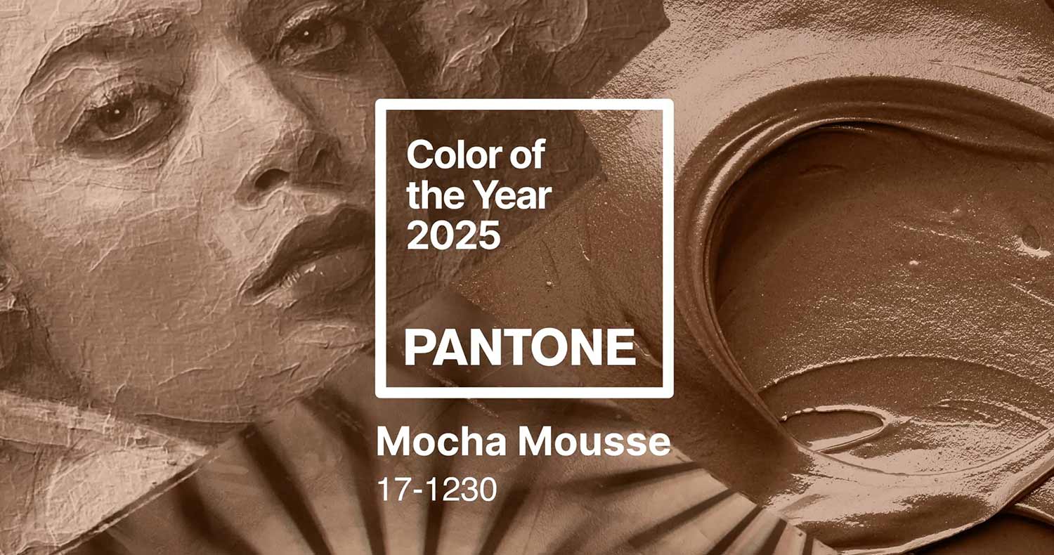
Pantone’s Colour of the Year announcement is a highly anticipated event in the design and creative industries. Every December, Pantone reveals a shade they believe will define the cultural zeitgeist for the coming year. While this annual tradition is celebrated by artists, fashion designers, and marketers, its relevance for small and medium-sized consumer packaged goods (CPG) brands is less clear. In this article, we’ll explore why the Pantone Colour of the Year might not be the best fit for most CPG brands, delve into the limitations it imposes on packaging strategies, and highlight the instances where it could still provide value.
Why Pantone Colour of the Year Falls Short for CPG Packaging
1. The Incompatibility with Ordering Cycles
Most small to medium-sized CPG brands operate on long packaging production cycles. These businesses often place print orders once or twice a year in large quantities to optimize costs and manage inventory efficiently. This cycle doesn’t align with Pantone’s annual colour reveal, which introduces a risk of packaging quickly becoming outdated.
For example, a snack brand printing thousands of units featuring the 2023 Colour of the Year would still be selling that stock well into 2025. By then, the once-trendy hue might feel stale or irrelevant, especially in industries that demand fresh and modern aesthetics. The pace of trend cycles doesn’t match the practicalities of inventory management.
2. A Limited Functional Connection
The utility of Pantone’s chosen colour often depends on its relevance to the product itself. Unless the Colour of the Year aligns with a flavor cue, ingredient, or thematic element of a product, its adoption might feel forced. For instance, a lavender-inspired colour might work well for a calming herbal tea but would feel out of place on a spicy hot sauce. In these cases, brands would likely use such a shade anyway, regardless of Pantone’s endorsement, making the “Colour of the Year” designation irrelevant.
3. Budgetary Constraints and Risk Aversion
For small and medium-sized businesses, packaging isn’t just a design choice; it’s a critical investment. These companies can’t afford to take risks on trends that may alienate their target audience or fail to resonate in the long term. Incorporating Pantone’s Colour of the Year into packaging design could lead to unsold stock if the trend doesn’t catch on. Unlike large corporations, smaller brands don’t have the marketing budgets to offset such losses.
The Realities of Trend Adoption in CPG
1. Special Editions: A Tool for Big Players
Large corporations and premium brands can afford to embrace the Colour of the Year for limited-edition products. For example, a global chocolate brand might release a special-edition packaging design to celebrate Pantone’s chosen shade. These initiatives often serve as marketing stunts, generating press and social media buzz without needing to achieve significant sales figures.
However, for smaller brands, the ROI of such campaigns is harder to justify. Special editions require additional investment in design, printing, and potentially, marketing—a cost that might not yield measurable returns.
2. Marketing Gimmicks vs. Practicality
While the Pantone Colour of the Year garners attention in design circles, it often struggles to translate into practical business value for CPG brands. Packaging needs to serve a clear purpose: catching the consumer’s eye on crowded shelves while conveying key brand messages. A random trendy colour might dilute the brand’s identity rather than enhance it.
Where the Pantone Colour of the Year Can Shine
Despite its limitations, the Colour of the Year isn’t entirely without merit. Here are a few scenarios where it can provide value:
1. Social Media Content
For small to medium-sized brands, social media offers a low-risk way to engage with the Colour of the Year. Brands can create content—such as trend-focused Instagram Reels or TikToks—that celebrates the colour without committing to it in their physical packaging. This approach allows brands to leverage the trend while it’s still relevant.
2. Seasonal Campaigns
Incorporating the Colour of the Year into digital marketing assets or seasonal campaigns can be a smart way to stay on-trend without the risks associated with physical stock. For example, a brand could update its website banners, email templates, or promotional materials with Pantone’s shade to reflect cultural relevance.
3. Collaborations and Pop-Ups
For brands looking to test the waters, collaborations or pop-up activations can offer an experimental space. Partnering with local artists or influencers to showcase the Colour of the Year in creative installations or events can generate buzz without long-term commitments.
4. Inspiration for Internal Design Work
Pantone’s Colour of the Year can also inspire internal design projects. Brands can use it as a creative starting point for brainstorming or trend forecasting, even if it doesn’t directly make its way onto packaging.
A Balanced Takeaway
While Pantone’s Colour of the Year might be a useful tool for sparking conversations and inspiring creativity, it’s not a one-size-fits-all solution for CPG brands. Small to medium-sized businesses should approach it with caution, focusing on its potential for digital marketing and low-risk experiments rather than committing to it in large-scale packaging orders.
For most CPG brands, the practical realities of ordering cycles, budget constraints, and brand consistency outweigh the ephemeral appeal of an annual colour trend. However, for those willing to think outside the box, there are still ways to leverage Pantone’s Colour of the Year as part of a broader marketing strategy.
Additional Reading:
What are your thoughts on Pantone’s Colour of the Year? We’re always happy to hear from you, and interested to discuss your point of view. Pantone can be an incredible tool when used in the right way, we can help you get the best results from your brand, Packaging & Marketing budget. Get in touch with us today using the Let’s Talk form below.


