In the competitive world of packaging design, Pantone colours play a central role in achieving precision, consistency, and brand recognition. Whether you’re a brand manager or a designer, leveraging Pantone ensures that your packaging visually represents your brand, creating a memorable and cohesive experience across diverse platforms.
In this article, we’ll explore Pantone packaging trends, the importance of Pantone branding for packaging, and essential resources such as Pantone Coated, Uncoated, Metallic, and Pastel books that enable designers to bring ideas to life with high accuracy and consistency. Read on to learn how implementing Pantone in packaging can transform your brand, amplify recognition, and ensure lasting impressions on consumers.
Understanding Pantone’s Role in Packaging Design
Pantone is a universal language for colour, crucial to achieving branding consistency and accuracy in packaging design. Unlike CMYK, which uses four inks to mix colours during the printing process, Pantone colours are pre-mixed, providing unmatched vibrancy, consistency, and control. This quality is especially beneficial for brands that rely on specific colours to represent their identity—such as Coca-Cola red or Tiffany blue—ensuring that every product looks exactly as intended.
With Pantone, designers can communicate precise shades across the globe, from design teams to manufacturers, enabling brands to maintain a unified aesthetic from digital platforms to physical packaging. For packaging that needs to deliver an emotional impact and resonate with consumers, Pantone’s colour precision is an invaluable asset.
Why Use Pantone for Packaging Design?
- Consistency Across Materials and Platforms: Pantone’s pre-mixed colour formulas ensure that the exact same hue is produced in every print run, creating brand consistency across digital and physical media.
- Enhanced Accuracy in Colour Reproduction: With Pantone, brands achieve specific shades with high accuracy, avoiding the slight variations common with CMYK printing.
- Global Recognition and Trust: Pantone allows designers and manufacturers worldwide to communicate colour choices precisely, facilitating a cohesive look across multiple regions and packaging materials.

Key Pantone Books for Packaging: Coated, Uncoated, Metallics, and Pastels
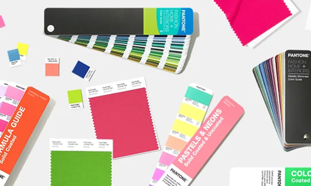
Pantone offers a range of specialised colour books that cater to various materials, finishes, and design objectives. Selecting the right book for your packaging project can enhance colour accuracy and help achieve the desired effect on the shelf. Here’s how each book can elevate your packaging design:
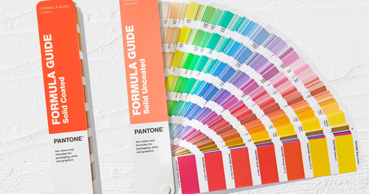
- Pantone Coated: Ideal for glossy materials that highlight vibrancy, the Coated book is designed for projects where colour intensity is key. Coated paper reflects light, making colours appear brighter and more saturated—perfect for products that need high-impact packaging to attract attention.
- Pantone Uncoated: The Uncoated book offers colours that are ideal for natural, organic, and eco-friendly packaging. Uncoated finishes absorb more ink, resulting in a muted, softer look. This makes it a good choice for artisan brands or sustainable packaging, where subtlety and authenticity are part of the brand’s appeal.
- Pantone Metallics: Metallic shades offer a premium, high-end feel, adding a luxurious touch to packaging design. The Metallic book includes rich, shimmering hues that are especially effective for beauty, cosmetics, and luxury foods, where sophistication is paramount. Using metallic Pantone colours can elevate the product’s visual appeal and enhance its perceived value.
- Pantone Pastels: Subtle and versatile, Pantone’s Pastels are well-suited for modern, minimalist, and trendy brands. Pastels convey a sense of calm and approachability, making them ideal for products targeting younger, trend-savvy audiences. They work particularly well in health, beauty, and lifestyle brands seeking a gentle, inviting feel.

Leveraging Pantone for Effective Brand Identity in Packaging
Colour plays a psychological role in branding, with the power to evoke emotions and create associations in consumers’ minds. A carefully curated Pantone colour palette allows brands to tell their story through packaging, shaping consumer perception and reinforcing brand loyalty.
Consider these examples:
- Bold Colours: Bold Pantone hues communicate confidence, energy, and innovation, which is why they’re favoured by brands that want to make a strong statement. Companies focused on cutting-edge technology, adventure, or youthful vitality may choose bold colours to reflect their brand personality.
- Soft Tones: Pastels and neutrals evoke calmness, trust, and approachability. These colours are often chosen by wellness, beauty, and lifestyle brands aiming to convey a sense of natural balance and simplicity.
Practical Considerations for Implementing Pantone in Packaging Design
While Pantone offers unparalleled colour accuracy, designers must consider material and finish when implementing it in packaging. The same colour can appear differently on various materials or finishes—such as glossy vs. matte or coated vs. uncoated paper—which can significantly impact the look and feel of the packaging. Conducting test prints and adjusting designs according to these material variables can prevent mismatches and ensure that the packaging truly represents the brand’s vision.
- Material Testing: To ensure accuracy, print samples on different materials before final production. This helps identify how the Pantone colour will interact with your chosen packaging material, such as glass, plastic, or cardboard.
- Colour Management: Utilise Pantone’s Colour Bridge tools for Pantone-to-CMYK conversions when digital and print consistency is needed. These tools help maintain colour integrity across platforms, ensuring a seamless brand experience from digital screens to physical packaging.
How Printers Measure and Monitor Pantone Colour Printing in a Commercial Environment
In a commercial printing setting, achieving precise and consistent Pantone colours is a top priority. Professional printers rely on specialized tools and techniques to ensure that the printed colours match the original Pantone specifications accurately. One of the key metrics used in this process is Delta E, which measures the difference between the intended colour and the printed result. A lower Delta E value indicates a closer match, with values below 2 considered imperceptible to the human eye, ensuring that the colours are reproduced as faithfully as possible.
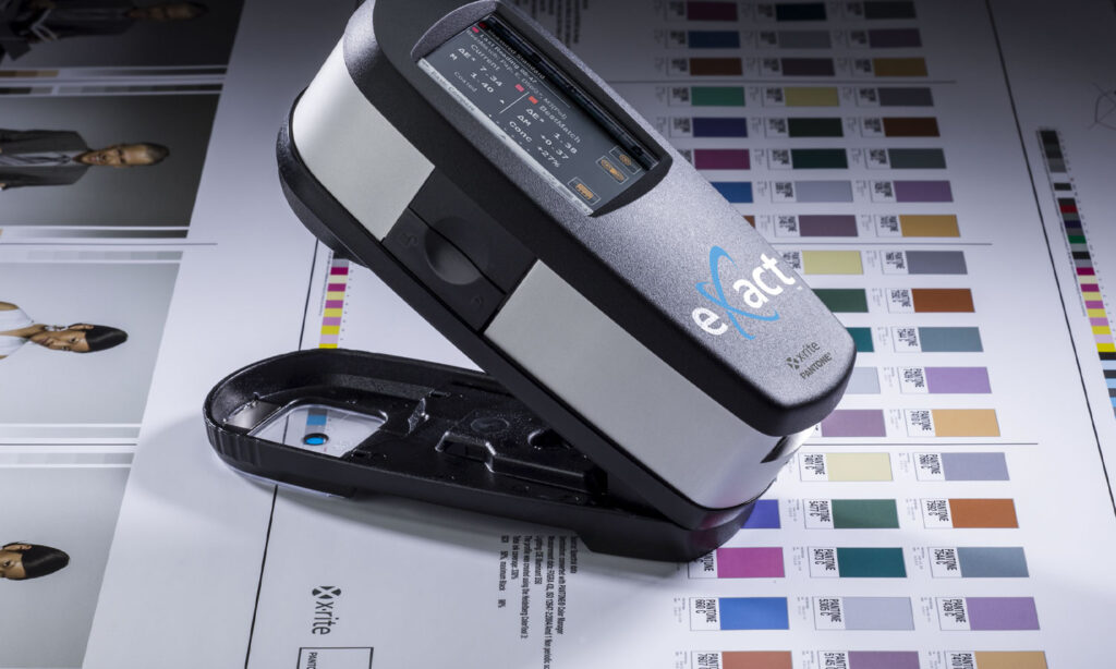
To monitor and control these colour differences, printers often use advanced equipment like the X-Rite spectrophotometer. This device scans printed samples and provides a detailed analysis of the colour, comparing it against the Pantone standard. The data helps printers make real-time adjustments, ensuring that each batch of packaging meets strict quality standards. By using tools like X-Rite and adhering to Delta E guidelines, commercial printers can deliver high-quality, consistent results, enhancing the overall appearance and impact of the packaging.

FAQs on Pantone Packaging Design
To address common questions, we’ve compiled answers that will guide you in understanding the full potential of Pantone for packaging design.
What is Pantone, and why should I use it?
Pantone is a global colour-matching system that allows for precise colour reproduction across different mediums. It’s essential for branding and packaging because it guarantees colour consistency, critical for brand recognition and consumer trust.
Why are Pantone colours important in packaging design?
Pantone colours allow brands to achieve consistency in how their packaging appears across various platforms and products, creating a uniform brand experience that consumers recognize and remember.
Why use Pantone instead of CMYK?
Pantone provides pre-mixed colours, which are more vibrant and consistent than CMYK, which can vary with each print run. Pantone is ideal for brands needing specific colours in their branding elements.
When should I use Pantone?
Pantone is best used for elements requiring precise colour matching, such as logos, brand colours, and primary design features that must remain consistent across all materials.
Is Pantone colour accurate?
Yes, Pantone is highly accurate; however, slight variations can occur based on the material or finish. Conducting sample prints can help ensure the final product meets brand standards.
Final Thoughts: Increasing Brand Success with Pantone in Packaging
Choosing Pantone for packaging design is more than a visual choice; it’s a strategic decision to enhance brand recognition, build consumer trust, and communicate values effectively. From Coated to Metallics, each Pantone resource offers unique opportunities to make a lasting impression. By selecting the right Pantone colour palette for packaging, brands can elevate their presence in the market and make a memorable impact on consumers.
For more insights into Pantone packaging design trends or assistance in crafting a packaging strategy that aligns with your brand, use our Let’s Talk form below to get in touch. Our expertise in packaging design and marketing has been developed with decades of experience in helping brands like yours create new product development packaging and refine existing packaging to better engage with consumers and have the wow factor on the shelf.
Partner with Goulding Media for Expert Packaging Design
For more insights into Pantone packaging design trends or assistance in crafting a packaging strategy that aligns with your brand, reach out to Goulding Media. Our expertise in packaging design and marketing ensures your brand’s packaging stands out on the shelf while maintaining the integrity and impact you envision. With a proven track record of delivering high-quality, visually cohesive packaging solutions, Goulding Media is your partner for success in a dynamic marketplace.


