The Barber’s House: Crafting a Unique Brand Identity for a Premium Hair Care Range
When a local barbershop owner decided to launch his own line of hair care products, he wanted branding that would reflect the quality and style his customers had come to love. Enter The Barber’s House, a range of premium grooming products inspired by the classic charm of the shop itself. We were brought on board to help develop the brand’s identity and create a cohesive, eye-catching hair product packaging design that would stand out on shelves and appeal to loyal customers.
Bringing the Vision to Life: From Shop Sign to Brand Mark
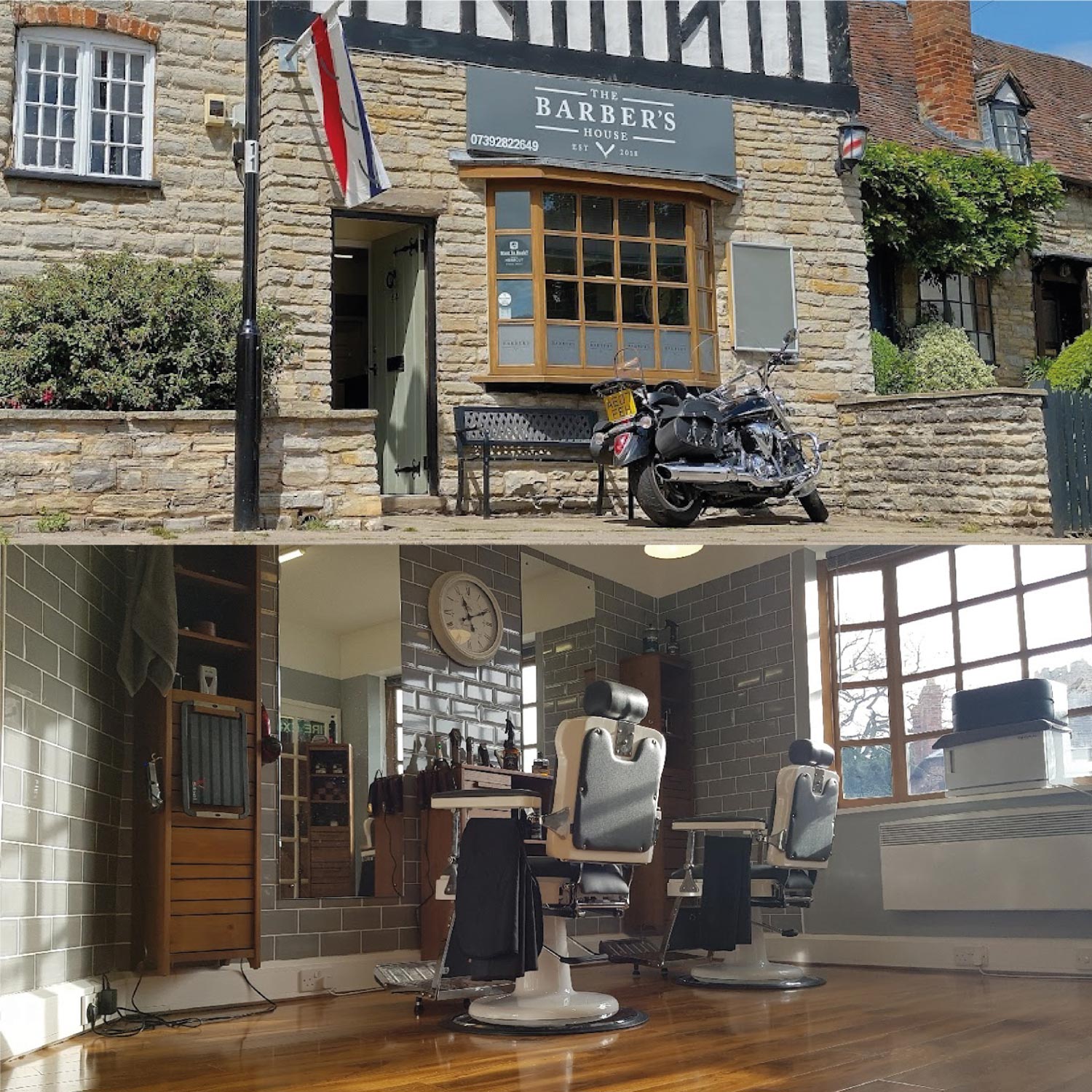
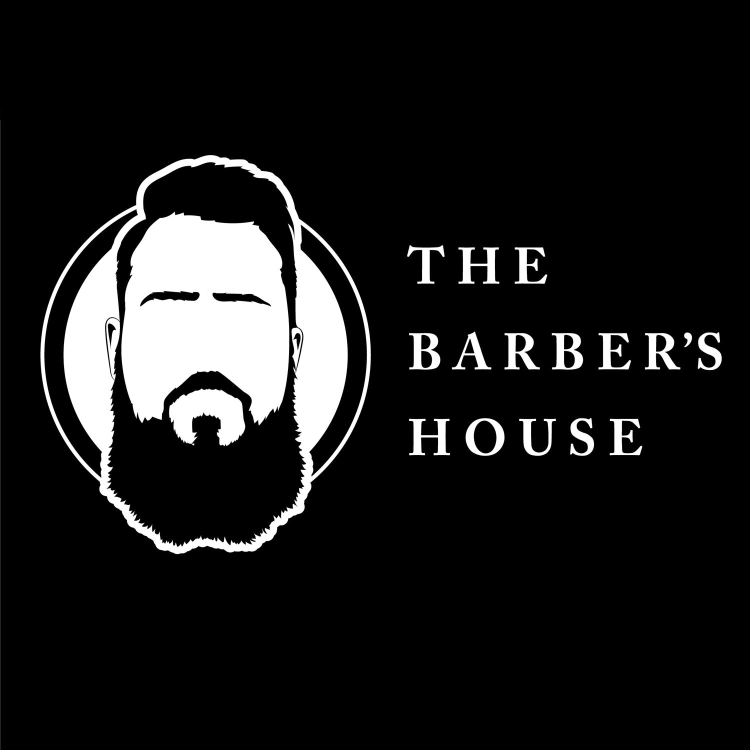
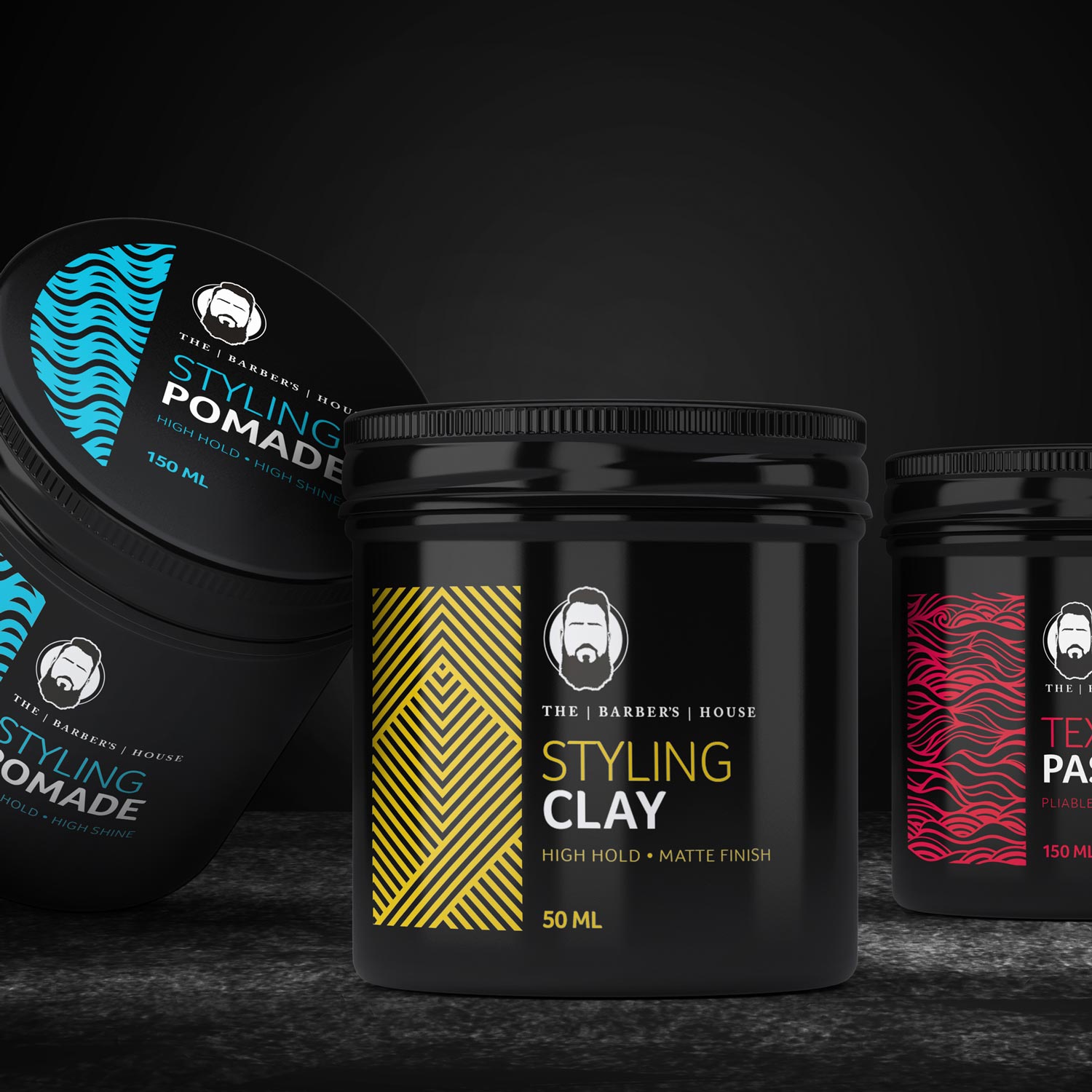
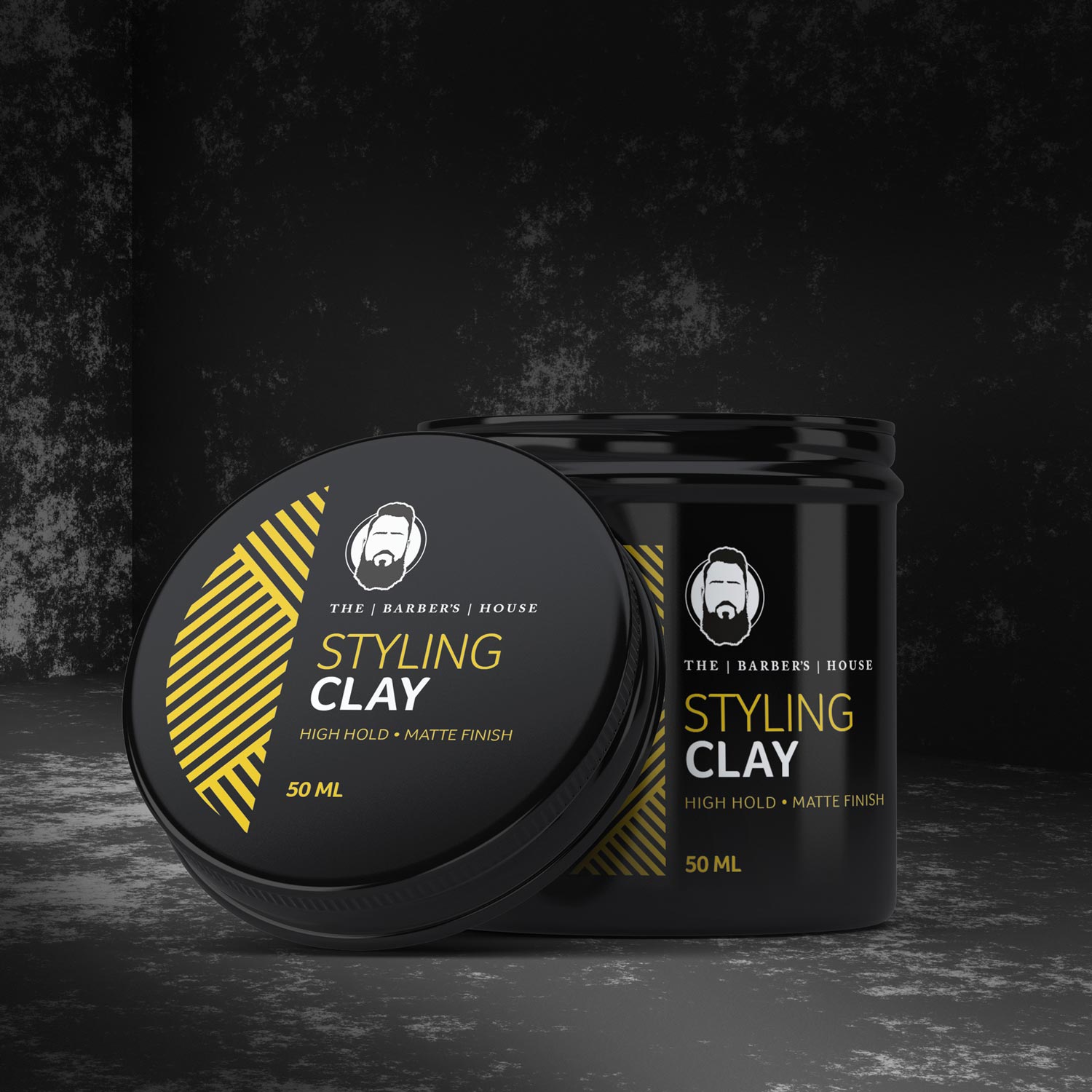
The first step in our creative journey was to establish a strong visual identity that connected the product line to the barbershop’s existing charm. We started by crafting a brand mark that paid homage to the shop’s iconic sign, utilising the same familiar lettering style. At the heart of the design is an emblem featuring a striking silhouette of the shop owner—complete with his distinctive beard—creating a memorable and uniquely personal logo. The emblem became the centrepiece of the brand, giving the packaging a recognisable and authentic signature.
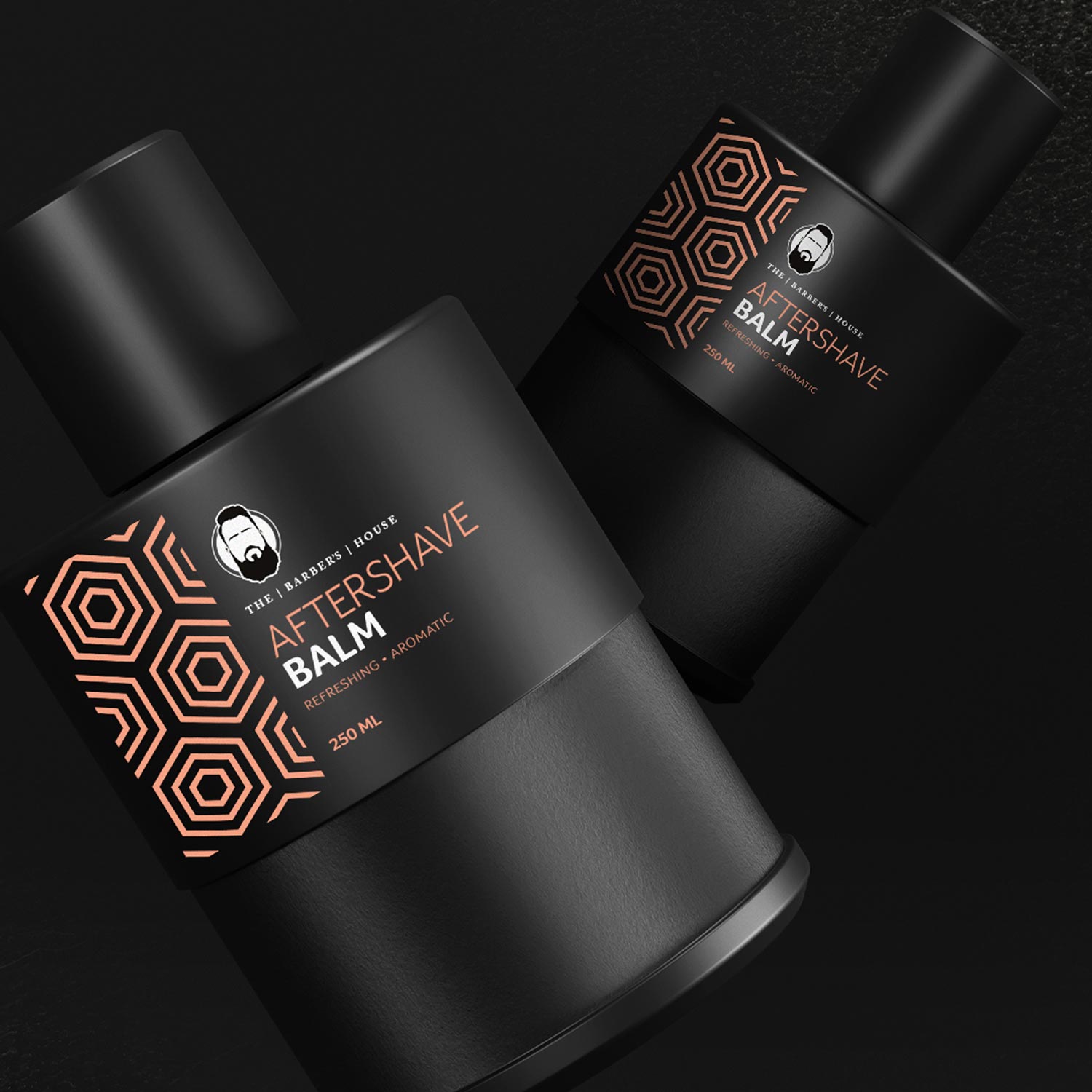
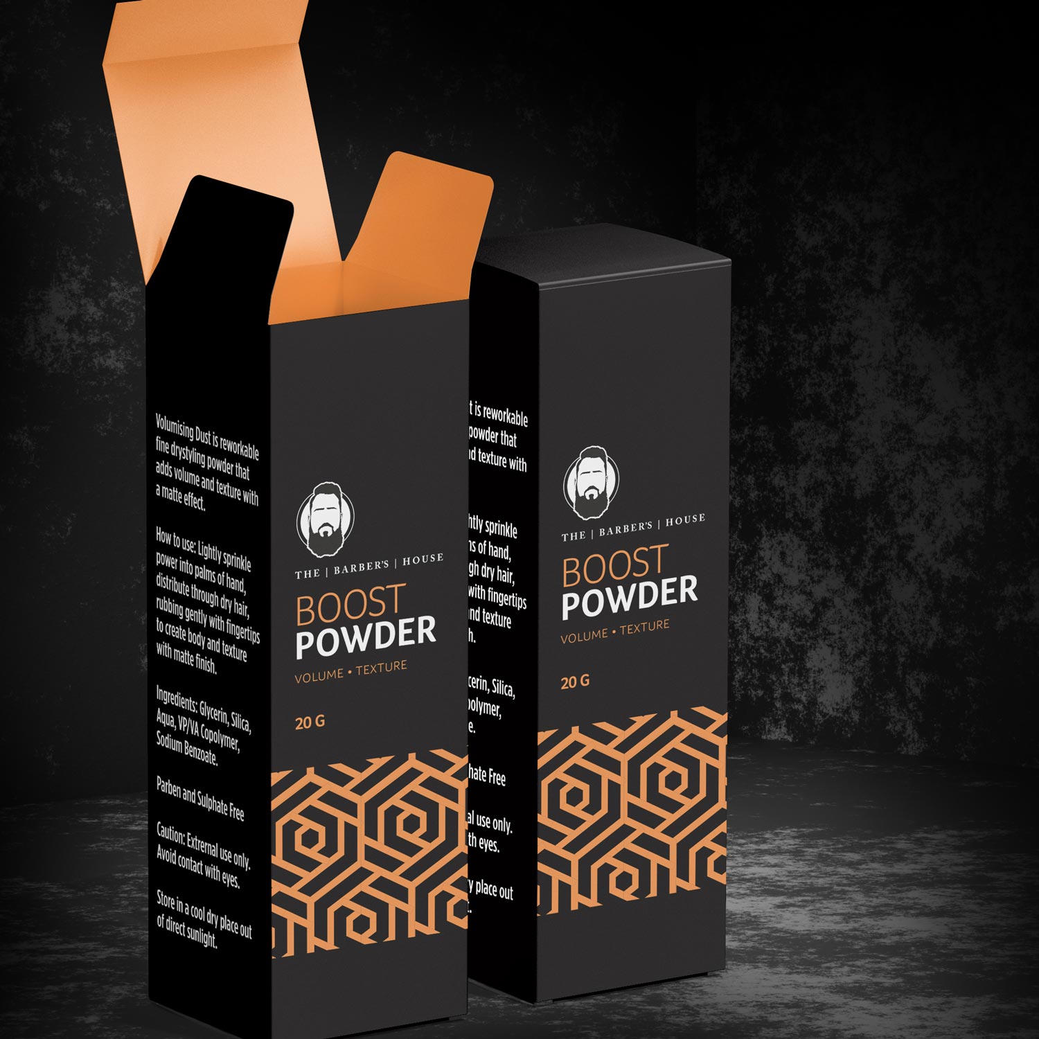
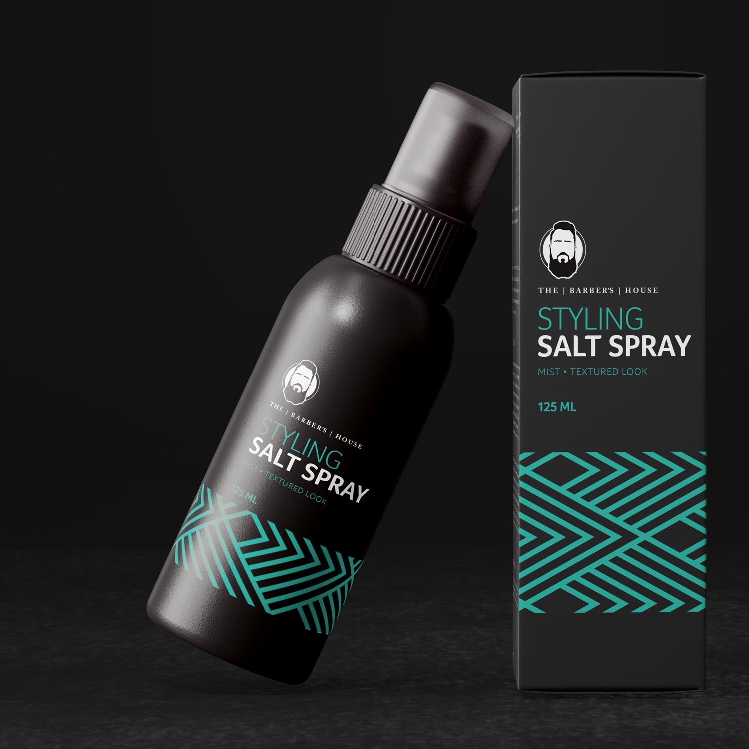
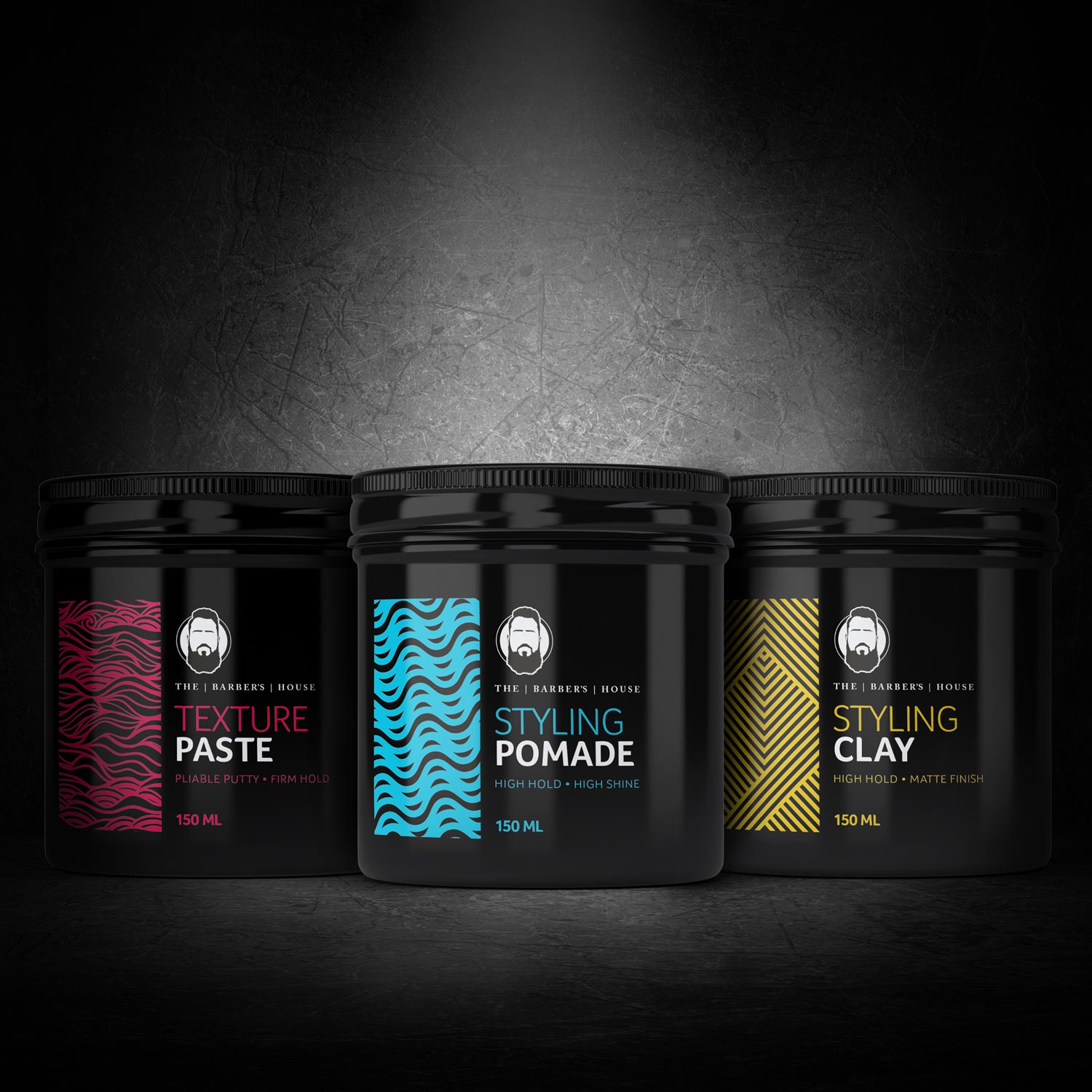
To complement the bold emblem, we developed a modern minimalist packaging style using a sleek black base, accented by vibrant, spacious typography. The combination of a dark, sophisticated colour palette with individual popping coloured patterns created a hair care packaging design that looks and feels luxurious, embodying the premium quality of the products inside.
Creating a Cohesive, Standout Product Line
The main challenge was to develop a packaging style that could be easily adapted across the full range of hair care products, from waxes and pomades to salt spray and aftershave. We solved this by designing a distinctive pattern feature that could be applied in different colour variations for each product type, maintaining a cohesive look while allowing for individual product differentiation. This approach ensured that each item had its own unique flair while still feeling like part of a unified, luxury collection.
The results were met with enthusiasm—the owner of The Barber’s House was thrilled with the sleek, modern packaging for hair products, and customers quickly took notice, praising the new line for its stylish, premium look. The range has become a staple in the shop, with its eye-catching hair product packaging drawing attention and reinforcing the quality that The Barber’s House is known for.
Discover More About Our Creative Packaging Solutions
We loved working with The Barber’s House to bring this luxury hair care range to life. If you’re looking to elevate your brand with innovative hair products packaging design, explore our portfolio or reach out to us using the ‘Let’s Talk’ form below to see how we can help you create a standout product line that captures your vision.
