Consumer Packaging Design Product Range Visual System
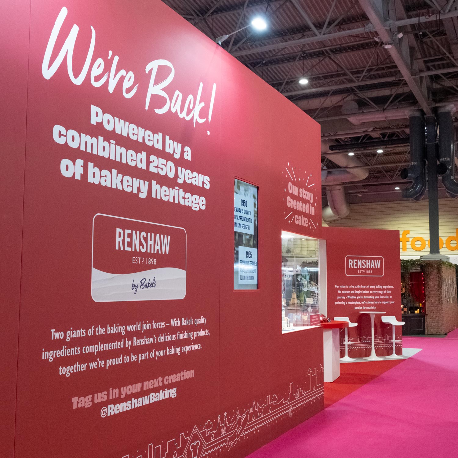
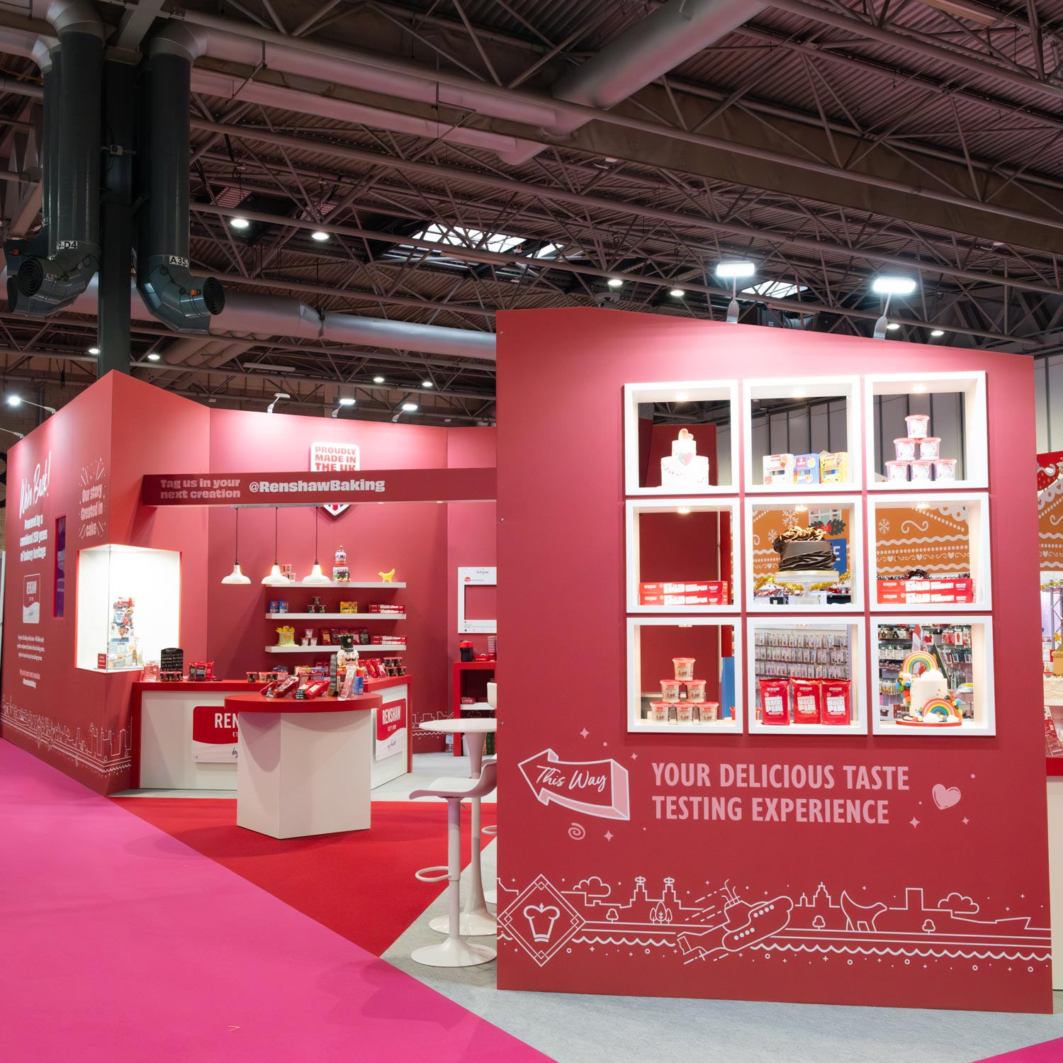
When Renshaw faced an uncertain future, their packaging needed to do more than look better — it had to help reset the brand, clarify the range and rebuild confidence with retailers and consumers. Through a considered evolution of their emerging visual identity, we provided continuation of their modernised new look, simplified the range architecture and created a distinctive style that stands strong on shelf.
THE CHALLENGE
At the time of the project, Renshaw’s parent company was in serious financial difficulty and on the brink of collapse. Following the acquisition by British Bakels, new investment created an opportunity — and urgency — to reassess the brand from the inside out.
Packaging had begun to be refreshed across a few icing products, but the system was incomplete, inconsistent and not fully future-proofed. Much of the range still felt dated, overly professional in tone, and unclear in how products were positioned for different types of bakers.
Renshaw needed to:
Align packaging with the new strategic direction under British Bakels.
Refresh the visual identity without discarding the redesign work already started.
Modernise their core marzipan offer, which looked old-fashioned and no longer fit its price tier.
Bring clarity to how products were organised across the portfolio.
Improve print reliability — particularly around the “Established 1898” brand mark, which was failing on press.
THE SOLUTION
We evolved the emerging Renshaw style rather than starting again, strengthening it around a bold, deep red that became a distinctive visual signature on shelf.
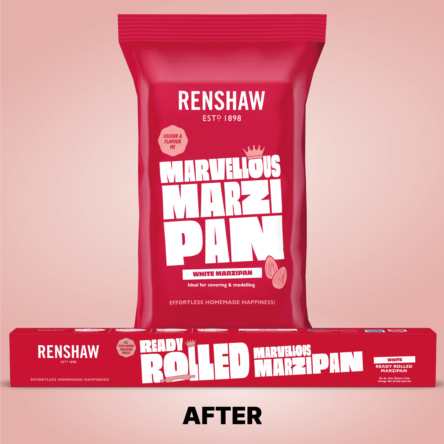
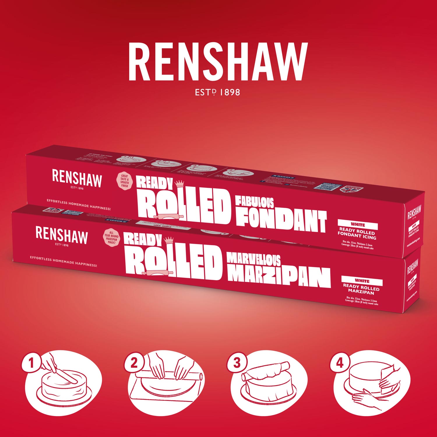
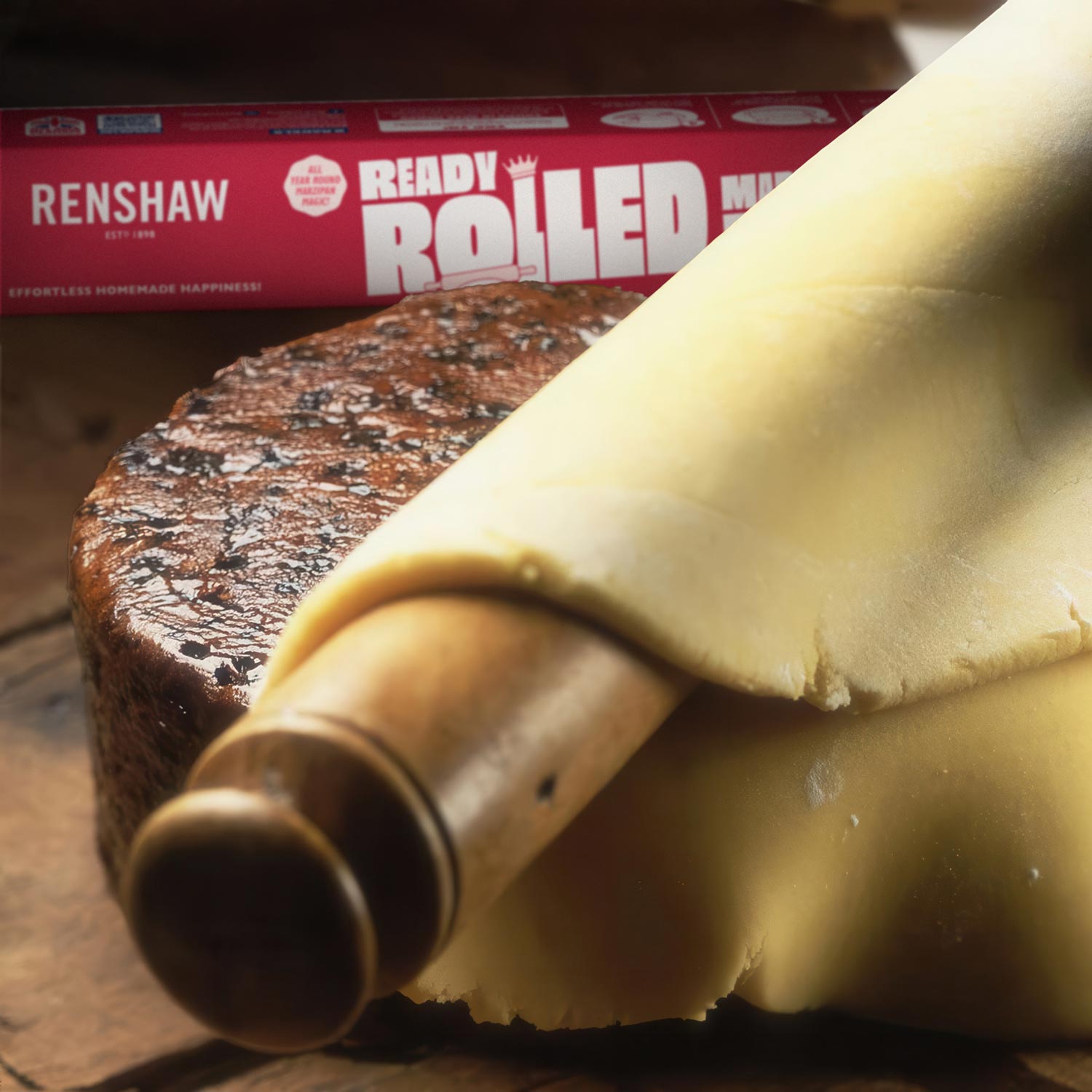
We began with Ready to Roll Marzipan as a lead project for the new direction. The bold, stylised typography was refined so “Marzipan” worked across two lines, giving it greater presence and a more contemporary feel.
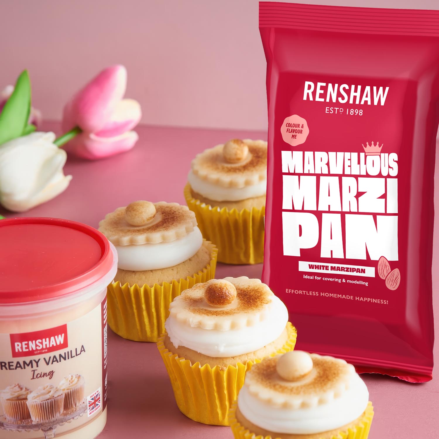
Recognising that marzipan was returning to popularity beyond traditional cake covering, we introduced the name Marvellous Marzipan to make the product feel more relevant, playful and versatile. This was supported by hand-drawn almond illustrations and a subtle crown device, which is a meaningful nod to Renshaw’s origins on Crown Street, Liverpool.
At a strategic level, we helped Renshaw reorganise their portfolio into three clearer tiers: Core, Specialist and Premium, and created consistent packaging templates for each. This gave Renshaw a scalable design system and a clear logic shoppers and trade buyers could understand.
We addressed a key print issue: the “Established 1898” mark had been filling in on press. Without changing the logo, we increased its size and thickened the lettering so it reproduced cleanly and reliably.
Finally, we extended the new visual language into marketing, using the striking red palette and illustrative style to create a more modern, cohesive brand world across packaging and communications.
THE RESULT
The refreshed packaging revitalised Renshaw’s presence in the market at a crucial moment in the company’s history. Buyers responded positively to the new look, and internally the business embraced both the visual direction and the clearer range structure.
While formal sales data was not shared with us, stakeholders consistently reported that the redesign had helped “bring the brand back to life” at a time when its future had been in serious doubt. Importantly, much of the work we delivered is still in use today — a strong indicator of its longevity and effectiveness.
Even after a change in Marketing Director, the existing marketing team actively wanted to continue working with us, demonstrating the trust and value they placed in the work.
Ultimately, the project delivered more than a cosmetic upgrade: it gave Renshaw a confident, modern platform for growth, clearer navigation for shoppers, and packaging that performed reliably both in-store and in production.