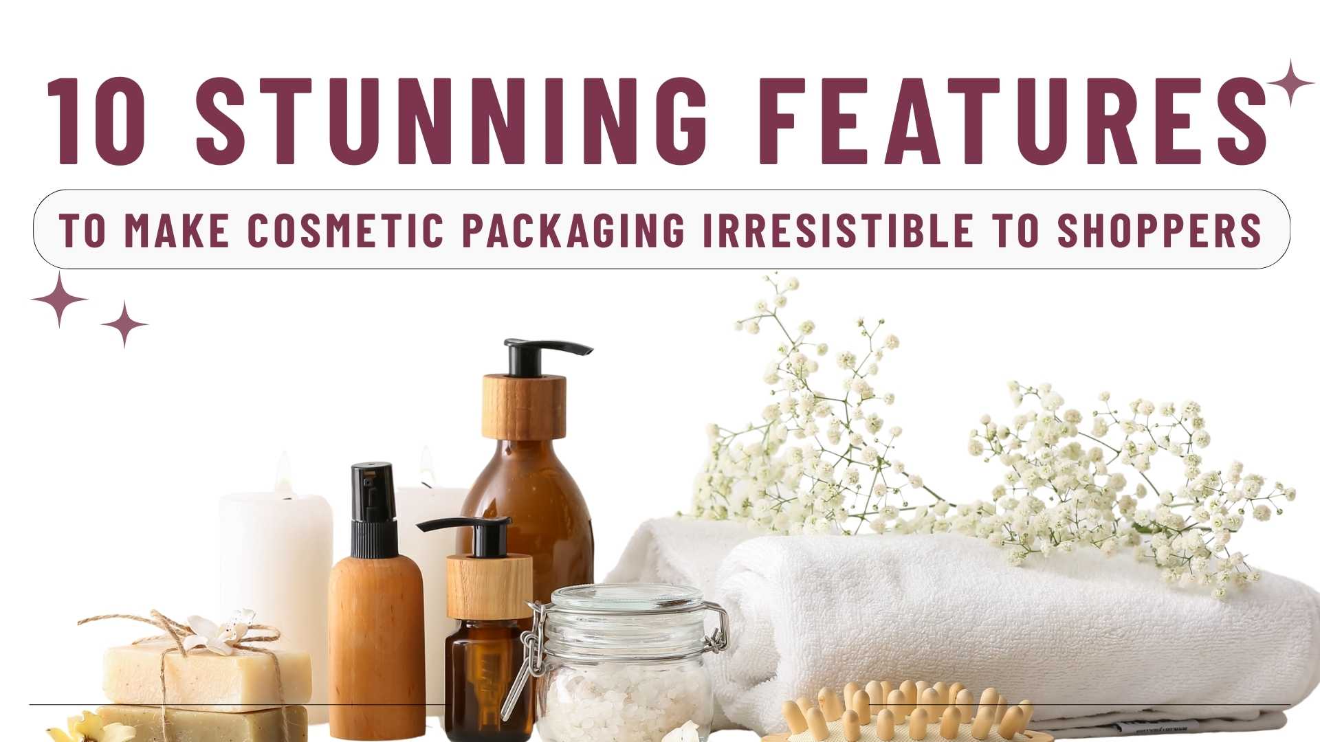
Walk down any beauty aisle or scroll through an online shop, and one thing becomes clear: packaging is a key selling point. Before a customer even tries your product, they’ve already judged its value based on how it looks and feels in their hand—or on their screen. A well-designed package goes beyond just catching the eye, it builds trust, communicates benefits instantly, and makes your brand memorable long after the purchase.
To help you tap into that power, we’ve rounded up 10 standout cosmetic packaging features that will turn browsers into buyers. These ideas go beyond aesthetics—they’re innovative strategies you can use to capture attention, connect with your audience, and give your brand an edge in a competitive market.
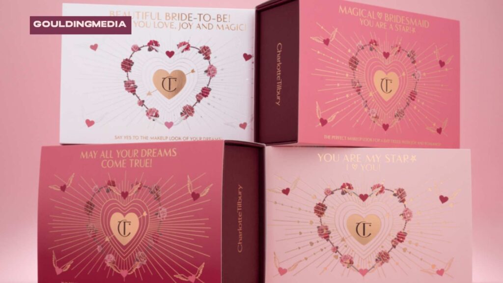
1. Eye-Catching Front-of-Pack Layout
The front of your package is the first handshake with your customer—it decides if they’ll pick your product up or pass it by. A well-structured front panel makes your brand instantly recognisable and communicates value in seconds.
Key elements to focus on:
Clear hierarchy of text
Lead with your brand name, then the product type, followed by a standout benefit (e.g., “hydrating,” “eco refill,” or “SPF protection”).
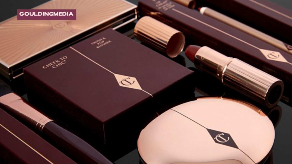
- Charlotte Tilbury places the logo and product name front and centre, with benefits like “Magic Cream – Instant Turnaround Moisturiser” highlighted in bold.
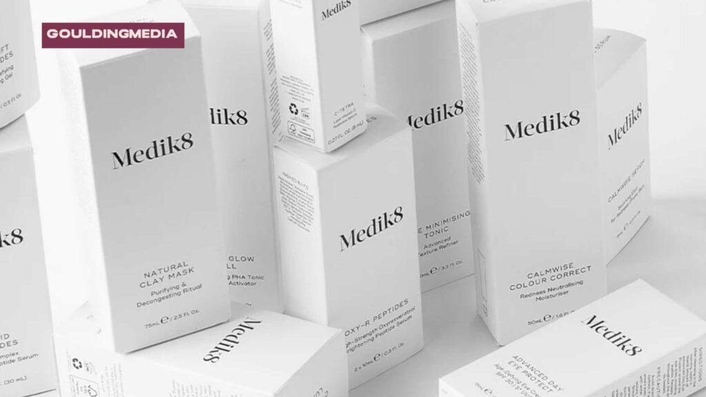
- Medik8 uses a structured, clinical layout: brand first, product type second, and benefits like “Purifying” or “Decongesting” placed clearly below.
Balanced use of space
Leave enough breathing room so the design feels clean and professional rather than overcrowded.
- Pai Skincare uses generous whitespace and soft typography to create a premium, calm aesthetic.
- Beauty Pie applies clean grids and simple black-and-white contrast, letting the text hierarchy do the work without clutter.
Strategic imagery or icons
Icons and subtle motifs can quickly signal values like sustainable cosmetic packaging, vegan-friendly, or dermatological testing.
- AMELIORATE highlights its dermatological credibility with clinical-style badges and icons.
- ELEMIS often uses botanical motifs or water imagery on the front panel to suggest spa-like natural luxury.
2. Bold Typography Choices
Typography does more than spell out words—it conveys personality and builds emotional connection. Choosing fonts thoughtfully ensures your product doesn’t get lost on crowded shelves.
Highlighting key product benefits like “long-lasting” or “plastic-free” helps reinforce brand values. This is especially useful if you’re using eco-friendly cosmetic packaging or promoting refill systems.
How to make it work for your brand:
- Match font style to identity – Use sleek sans-serifs for modern or minimalist brands, elegant serifs for premium/luxury products, and playful handwritten fonts for youth-oriented lines.
- Highlight key benefits – Adjust font size and weight so selling points like “long-lasting” or “limited edition” instantly grab attention.
- Stay consistent across packaging – Use the same font family or style across your product range to strengthen recognition and trust.
3. Colour Palette with Intent
Colour is more than decoration—it’s a silent salesperson. Customers make snap judgments about products within seconds, and colour plays a big role in that decision. Small businesses can use colour with intent to carve a strong identity.
- Muted tones for luxury cosmetic packaging: If you’re positioning your brand as premium (like artisanal skincare or high-end candles), muted palettes such as soft greys, creams, or deep charcoals immediately signal sophistication.
- Bright pastels for approachable fun: For playful, friendly brands (think boutique candy shops, children’s products, or lifestyle goods), light pinks, mints, and yellows build warmth and approachability.
- Earthy tones for biodegradable cosmetic packaging or recyclable cosmetic containers: Greens, browns, and beige instantly tell customers you care about sustainability, perfect for organic food or natural cosmetics.
- Contrast for clarity: No matter your style, always ensure the background and text stand apart. A bold product name that’s readable on a small package can make the difference between being noticed and overlooked.
Pro Tip for Small Businesses: You don’t need a dozen colours. Stick with 2–3 consistent shades across all packaging and marketing. This builds recognition faster and keeps printing costs down.
4. Shape and Structural Innovation
While large corporations may invest in extravagant customised shapes, small businesses can still use clever design choices to stand out.
- Unconventional shapes: For example, airless pump bottles protect formulas and give a premium touch, while unique cosmetic jars and containers can enhance brand perception. A lipstick tube in a hexagon shape or a curved bottle for serums doesn’t just look good—it makes your product instantly Instagram-worthy.
- Ergonomic designs: Customers love cosmetic packaging that feels good to hold. A small tweak—like rounded corners or a pump that dispenses smoothly—can leave a lasting impression.
- Shelf standout: Even if your budget doesn’t allow for custom moulds, you can innovate with labels, sleeves, or add-ons that change the perceived structure. For example, a Kraft paper wrap around a standard jar signals eco-friendly values while still keeping costs in check.
- Limited Edition: Launching limited ranges provides the consumer with something unique or personalised, with the feeling of uniqueness. Often allowing you to increase the price point for limited edition products.
Test shapes and formats in small batches before committing to large production. Local printers and short-run packaging companies can give you flexibility without tying up too much cash. Small brands can also experiment with sleeves, wraps, or labels to create the feel of custom cosmetic packaging without large investments.
5. Finishing and Texture
The finish you choose can completely shift how people perceive your product.
- Matte for premium or bespoke beauty packaging gives a modern, premium, and understated look. They’re perfect if you want your brand to be seen as sophisticated, eco-friendly, or high-end. Think of luxury skincare or artisan coffee packaging.
- Glossy finishes create shine and grab attention on shelves or in online photos. They work well for products targeting younger audiences or when you want a bold, vibrant feel.
Moreover, people don’t just see packaging—they feel it. Adding texture gives your brand a tactile edge that big brands use to their advantage.
- Embossing and debossing add dimension to your logo or tagline, making your brand more memorable.
- Foil stamping for luxury cosmetic packaging (gold, silver, or holographic) instantly adds luxury and catches the eye in online product photos.
- Soft-touch coatings give a velvety feel that makes your packaging stand out in the customer’s hand.
6. Minimalism vs. Maximalism
Your design style should match your audience and brand values.
- Minimalist designs use clean layouts, lots of white space, and subtle details. This approach signals professionalism, sophistication, and trust. Minimalist brands often lean on refillable cosmetic packaging or plastic-free cosmetic packaging to signal also eco-conscious values. It’s especially powerful if you’re a small brand competing in industries like skincare, health, or wellness.
- Maximalist designs, on the other hand, use loud colours and layered visuals—perfect for brands using printed cosmetic boxes to grab attention online and offline. This works great for small brands in beauty, food, or lifestyle spaces where being eye-catching online is just as important as on shelves.
Small business tip: You don’t have to commit to one extreme. For example, a mostly minimalist design with a bold pattern accent can balance sophistication with personality.
7. Transparent Windows or Clear Bottles
Consumers often feel more confident when they can see what they’re buying. Packaging with transparent windows or clear bottles builds trust by removing uncertainty—people know exactly what they’re getting.
This design choice is especially popular in skincare serums, lip glosses, and organic cosmetics, where product colour and texture matter.
For a small business, adding a window or opting for clear containers can be an affordable way to signal honesty and authenticity without a huge design budget.
8. Illustrations and Iconography
Custom illustrations add personality and give your packaging a unique flair. Think botanical sketches for natural skincare, abstract patterns for artisanal products, or playful hand-drawn icons for indie beauty brands. These details help you stand out against mass-market brands that often rely on generic stock visuals.
Icons, on the other hand, are simple yet powerful tools for quick communication. A small vegan leaf, cruelty-free bunny, or SPF shield tells customers exactly what they need to know at a glance.
This makes packaging easier to understand and more appealing, especially online, where buyers scroll fast.
9. Layered Storytelling on Secondary Panels
The front of your packaging may grab attention, but the side and back panels are where trust is built. These areas act as your brand’s “canvas for details.” Small businesses can use them to tell a richer story:
- Ingredient Transparency – Instead of listing ingredients in tiny print, explain where they come from. For example, “Our shea butter is ethically sourced from women’s cooperatives in Ghana.”
- Usage Instructions with Personality – Instead of generic directions, add your voice. A skincare brand might write, “Apply at night and let your skin drink it in while you dream.”
- Brand Philosophy – Share what makes your brand different. Big brands often sound corporate. Small businesses can win with honesty and authenticity, such as “We started in our kitchen, mixing formulas by hand to create something safe for our kids.”
Consistency in typography and layout is key. Even simple fonts and clean spacing can make your cosmetic packaging look polished and professional—without the cost of a luxury designer.
Treat your side panel like free advertising space. It’s an opportunity to connect emotionally with your customer and remind them why buying from you supports something bigger.
10. Photography and Visual Imagery
Strong visuals make cosmetic packaging instantly more memorable. For small businesses, thoughtful photography can bridge the gap between “local brand” and “professional competitor.” Here’s how:
Lifestyle Photography
Show your product in action. A lip balm with a model applying it outdoors conveys freshness and everyday use.
- Charlotte Tilbury regularly shows products being applied in glamorous, real-life settings, reinforcing its “red carpet ready” image.
- Aveda leans into lifestyle shots of models in natural environments, highlighting its botanical and eco-conscious roots.
Ingredient Imagery
Use close-ups of real ingredients, like aloe leaves, botanicals, or coffee beans, to emphasise quality and natural sourcing.
- ELEMIS features marine and botanical imagery to highlight its natural spa heritage.
- Pai Skincare uses ingredient-focused visuals (like chamomile flowers and rosehip seeds) to reinforce purity and transparency.
Customer-Centric Photos
Highlight real customers or models who represent your audience. This builds relatability that big brands sometimes miss with overly polished stock photos. Revolution Beauty frequently uses diverse, real-life models in its packaging and campaigns to reflect inclusivity.
Texture and Finish Shots
Go beyond faces and ingredients by showcasing product textures, like creamy swirls of moisturiser or shimmering powder surfaces. Charlotte Tilbury often features close-up imagery of textures to hint at the luxurious product experience inside.
Even if you don’t have a huge budget, today’s smartphones and affordable lighting kits make it possible to create professional-looking images. Paired with clean design, your cosmetic packaging can instantly elevate to a premium feel.
Wrapping Up
Great cosmetic packaging is more than just a container—it’s an experience that shapes how shoppers see and remember your brand. Just combine the right design features, and you not only capture attention but also build trust and loyalty. The beauty industry is competitive, but smart packaging can make even small brands stand out alongside established names.
If you’re looking for a packaging designer in the UK or Europe to elevate your cosmetic packaging and make your products irresistible to shoppers, Goulding Media can help you bring these ideas to life. Let’s create packaging that doesn’t just sit on shelves but inspires customers to choose your brand every time.