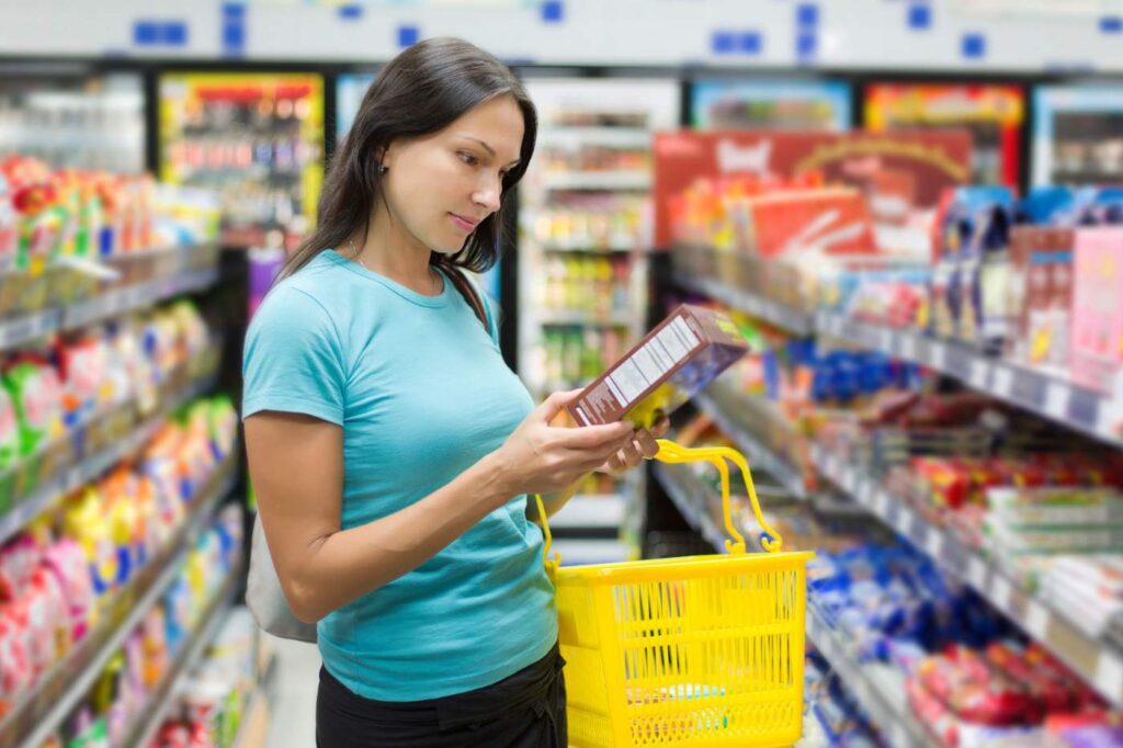
Shoppers make up their minds in as little as 7 seconds when scanning a retail shelf or browsing an online store. In that short window, your packaging either sparks curiosity and drives a purchase—or fades into the background.
This isn’t just about looks; it’s rooted in sales psychology, where attention quickly turns into interest and, ultimately, a buying decision. Understanding this “7 Second Rule” can change how you design your packaging, giving you a real edge in turning browsers into buyers.
The Science of First Impressions (Why 7 Seconds Matter)
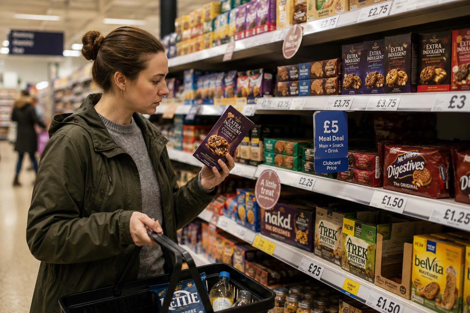
Shoppers don’t linger on the shelf or screen as long as most people assume. Studies in consumer psychology and neuromarketing show that people make snap judgments in as little as 7 seconds when evaluating products. This concept, often explained through the 7-second rule psychology, highlights how quickly we decide what captures our attention and trust.
In crowded aisles or digital marketplaces, that tiny window determines which product earns a second look—and which one gets ignored. The 7-second rule decision-making concept explains how these initial choices often happen before logic or comparison even begins.
Eye-tracking research backs this up. Shoppers scan a shelf visually in milliseconds, picking up on colours, shapes, and familiar brand cues before reading a single word. This process is tied to cognitive shortcuts our brains rely on:
- Familiarity Bias – We gravitate toward designs and colours we’ve seen before because they feel safe.
- Novelty Effect – At the same time, we’re hardwired to notice what stands out from the pattern. A package that breaks category norms can spark curiosity.
- Colour–Emotion Link – Colours trigger emotions and expectations instantly (green for natural, red for urgency, gold for premium, also think flavour cues).
In other words, your packaging performs a psychological sales pitch in seconds.
The 7-Second Success Framework
Step 1: Stop the Scroll/Eye (Visual Impact)
The first job of your packaging is to get noticed. If your design looks like everything else on the shelf, shoppers will pass it by. Use contrast—like bold colours against the norm or unusual shapes—to stand out instantly. You don’t have to be loud, but you do need to be different enough that eyes stop on your product. This is where the 7 second rule application becomes practical—visual impact must happen instantly.
Step 2: Spark Recognition (Brand Memory)
Once you have attention, buyers need to know it’s your product. Consistent use of your logo, colours, and fonts builds recognition. Familiarity creates trust, and when people recognise your brand quickly, they’re more likely to grab it instead of comparing prices or hesitating.
Step 3: Simplify the Message (Clarity in 2 Seconds)
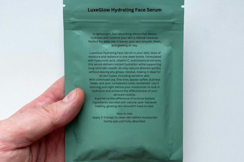
Too much text or clutter confuses people. Shoppers should understand what you’re selling within two seconds. Keep the main message short and clear. Use simple fonts, quick symbols or icons, and add QR codes if you need to share extra details. The package should answer: “What is this, and why should I buy it?”
Step 4: Invite Interaction (Touch/Texture)
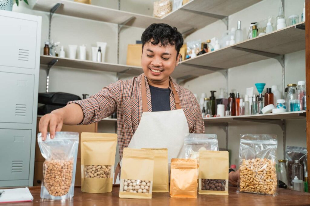
People are more likely to buy when they touch a product. Materials like matte finishes, embossing, or eco-textured papers make packaging more inviting. For online businesses, this happens during unboxing. A well-designed box or bag that feels special can turn a one-time buyer into a repeat customer who even shares the experience online.
Step 5: Align with Lifestyle & Values
Today’s customers want products that fit their lifestyle and values. Eco-friendly packaging, ethical sourcing, and designs that match cultural trends connect strongly with younger buyers like millennials and Gen Z. Use your packaging to show not just what your product is, but what your brand stands for.
Step 6: Close the Sale (Trust Signals)
Even when someone likes your product, doubts can stop the sale. Packaging should remove those doubts with trust signals. These can be certifications, eco-labels, “Made in [Country]” tags, or short origin stories. These details prove that your product is safe, honest, and worth the money.
Step 7: Reinforce Loyalty (Post-Purchase Packaging)
The sale doesn’t end when the product leaves the shelf. Packaging that’s reusable, collectable, or fun to share online keeps your brand in people’s lives. Think about coffee tins people keep, boxes they reuse, or unique designs customers post on Instagram. When packaging lives beyond the purchase, it keeps your brand top of mind.
Common Mistakes That Kill the 7-Second Chance
Even the best product can lose a customer in seconds if the packaging makes these mistakes. Avoiding them is just as important as following the right design steps.
1. Overstuffing with Text
Too many words overwhelm shoppers. If they can’t figure out what your product is at a glance, they move on. Keep your copy short and focus on the key benefits.
2. Poor Readability
Fonts that are too small, too fancy, or low-contrast make packaging hard to read. If buyers struggle to see your brand name or main claim, they won’t take the time to figure it out—they’ll just grab a competitor’s product instead.
3. Inconsistent Branding
When colours, logos, or styles don’t match your other products or marketing, shoppers hesitate. Inconsistency creates distrust, and people rarely buy what they don’t trust.
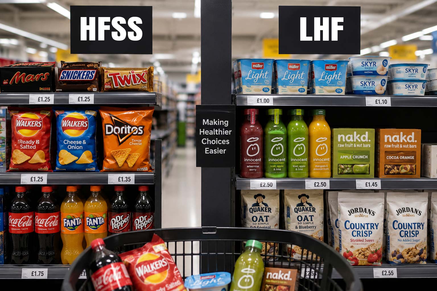
4. Ignoring Sustainability
More buyers—especially millennials and Gen Z—expect eco-friendly choices. If your packaging looks wasteful or outdated, you risk turning them away. Simple signals, such as recyclable symbols, eco-labels, or minimalist packaging design, can make a significant difference.
Case Studies: Brands That Nailed the 7-Second Rule
1. Innocent Drinks – Clarity and Playfulness
- What they did in 7 seconds: Innocent bottles use bold fonts, white space, and fun illustrations that quickly say “natural and friendly.” Shoppers immediately know it’s a smoothie made with simple, healthy ingredients.
- Sales impact: The brand grew to dominate the UK smoothie market, with 70%+ market share, showing that clear, playful design can convert browsers into loyal buyers.
2. Tony’s Chocolonely – Bold Colours, Clear Mission
- What they did in 7 seconds: The oversized block lettering and bright, nontraditional wrapper colours stand out instantly in the chocolate aisle. The mission statement—ending slavery in chocolate—comes across right on the packaging.
- Sales impact: UK revenues soared as ethical shoppers connected with the message, helping Tony’s expand shelf presence in supermarkets like Tesco and Sainsbury’s.
3. Graze – Simplicity and Transparency
- What they did in 7 seconds: Clear snack windows and clean labels let buyers see exactly what they’re getting. Minimal text avoids clutter while showing key benefits like “high protein” or “natural.”
- Sales impact: This transparency built trust quickly, helping Graze grow into a household name and later sell to Unilever for £150M.
4. Lush – Eco-Friendly Identity
- What they did in 7 seconds: Lush stands out by not using traditional packaging for many products. Where packaging exists, the black pots with bold white text are instantly recognisable and scream sustainability.
- Sales impact: The approach built a strong eco-conscious community. Customers keep returning because the packaging reinforces values, boosting repeat sales and loyalty.
5. Pret A Manger – Everyday Recognition
- What they did in 7 seconds: Pret’s burgundy star and consistent fonts make the brand recognisable across cups, boxes, and bags. Even without reading, buyers instantly link the star to fresh, ready-to-eat food.
- Sales impact: Consistency across packaging helped Pret build trust and expand globally. The packaging supports quick lunchtime decisions, fueling steady daily sales.
Actionable Checklist (Reader Takeaway)
Before your product hits the shelf, run it through this quick audit. If you can’t confidently answer “yes” to each point, your packaging may be leaving sales on the table.
- Grab attention at 3 feet away → Does the design stand out against competitors with bold colours, contrast, or shape?
- Communicate in 2 seconds → Can a shopper instantly tell what the product is and why it matters?
- Reflect brand voice → Does the look and feel match your brand personality—playful, premium, eco, or trustworthy?
- Invite interaction → Are there windows, textures, or unboxing elements that make people want to touch or explore?
- Highlight values → Does it signal what you stand for (sustainability, quality, ethics)?
- Build trust → Are certifications, clear labels, and compliance info easy to see?
- Create post-purchase recall → Will customers remember and share the experience (social-worthy design, reusable packaging, or a memorable unboxing)?
Wrapping Up
The 7-second window may seem brief, but it holds enormous power. Every choice, colour, font, shape, texture, and messaging can either capture attention or let it slip away. The brands that master this split-second decision know how to grab eyes, spark recognition, and build trust, all while reflecting their values and encouraging repeat purchases.
If your packaging isn’t converting as well as it could, it’s time to rethink your strategy. As a packaging designer in the UK, Goulding Media specialises in creating designs that not only look great but also sell.
Let us help you turn browsers into buyers with packaging that works in those critical first 7 seconds. Reach out today and see how we can elevate your brand on the shelf and online.