In the UK beauty & wellness supplement market, packaging plays a crucial role in shaping how consumers perceive a product’s quality and effectiveness. First impressions matter, and a well-designed, premium package can signal value, care, and credibility, especially when the results aren’t immediately visible.
While British shoppers prioritise product quality, younger consumers are particularly influenced by attractive, Instagram-worthy designs, and many buyers also look for eco-friendly or recyclable packaging.
Premium Packaging in UK Beauty Supplements: Key Examples
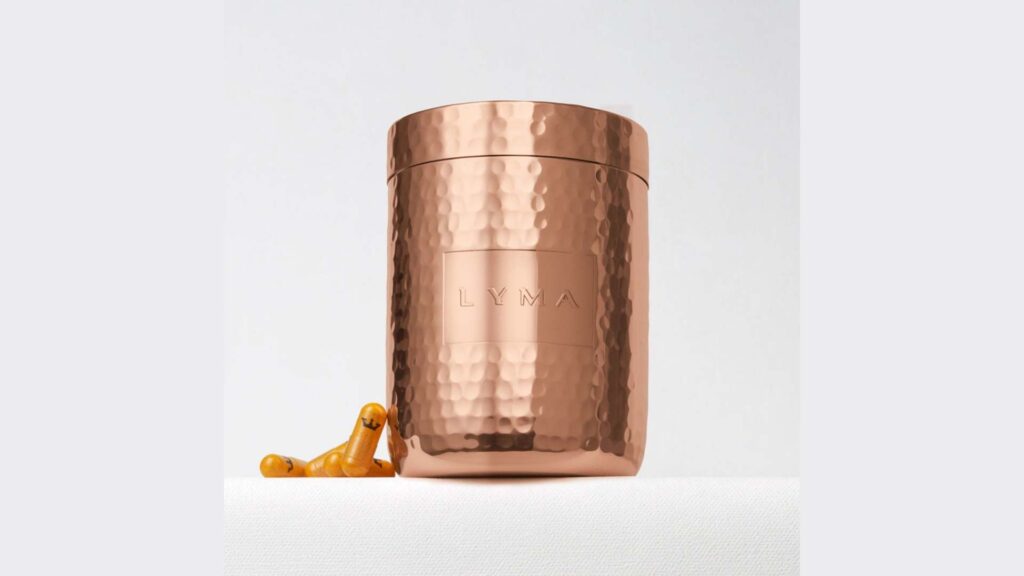
1. Lyma – “The Bulgari of Supplements”
Lyma, often dubbed “the Bulgari of supplements”, set a new standard with its hammered copper storage vessel and sleek black presentation.
The starter kit comes in an elegant black box with a 100% pure copper canister – a naturally antibacterial, jewel-like container that evokes both scientific seriousness and luxury.
This high-end packaging instantly signals that Lyma is a premium, scientifically advanced formulation worthy of a prominent spot on one’s vanity.
Perceived Efficacy & Trust:
The clinical-yet-luxurious design (clean typography, heavy metallic container) creates a halo effect – consumers may assume a supplement in such a “high-end, skincare-like” vessel is more potent or well-researched.
Even the Evening Standard noted the ultra-premium aura, reinforcing consumer trust. By packaging its 10-ingredient nutraceutical in a “presentation-worthy” format, Lyma ties efficacy to exclusivity, making users feel they’ve invested in something that must deliver results.
2. BetterYou – Scientific Simplicity & Convenience
BetterYou (a UK brand) is known for its nutrient oral sprays and transdermal magnesium oils, which come in sleek, pocketable spray bottles.
The packaging is functional and modern, with colour-coded designs for each nutrient (e.g. Vitamin D in sunshine yellow, B12 in vibrant pink).
This not only looks attractive on a shelf but also reinforces the brand’s scientific approach to absorption (the spray format itself suggests a cutting-edge delivery method).
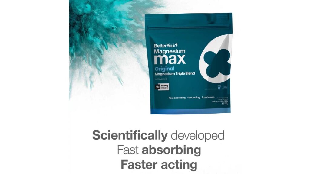
Credibility Cues
The design emphasises clarity – simple labels, bold lettering of the vitamin name, and dosing info right on the front. This minimalist, no-nonsense style aligns with a “clinical” vibe, implying efficacy.
BetterYou also highlights its “planet-friendly packaging” (100% recyclable materials) and UK-based formulation heritage, which boosts brand trust by showing commitment to quality and values.
Overall, BetterYou’s packaging balances approachability (bright, easy-to-use) with credibility (clear scientific info), influencing consumers to perceive the products as both user-friendly and effective.
3. Hunter & Gather – Natural Aesthetics & Sustainable Story
Hunter & Gather, a UK wellness brand, reflects its ancestral nutrition ethos through clean, natural-themed packaging.
Products like their collagen peptides come in simple, matte-finish pouches or jars with a minimalist label design – often neutral or earthy tones that convey an “all-natural” vibe.
The straightforward layout (bold product name, simple iconography) suggests purity and honesty, aligning with the brand’s no-fillers, no-nasties message.
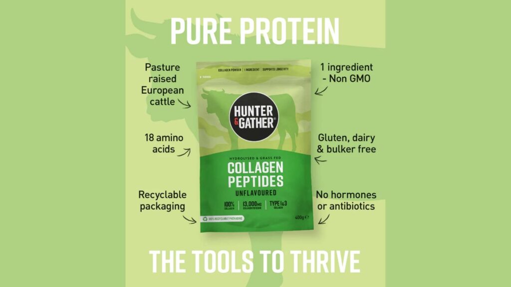
Sustainability & Trust
This brand leans into sustainable premium – using 100% recyclable, resealable pouches and completely plastic-free shipping packaging. These material choices not only appeal to eco-conscious UK consumers (for whom sustainability is a growing priority) but also enhance perceived quality: a brand that invests in eco-friendly packaging signals responsibility and high standards.
The tactile quality of the packaging – sturdy paper-based bags, quality seals – gives a sense of artisan quality, which can make consumers feel the supplement itself is crafted with equal care.
Design Elements that Convey Quality and Credibility
Premium packaging isn’t just about looking nice—it signals quality, effectiveness, and trust. In beauty supplements, where results aren’t immediate, packaging cues are especially important.
Materials & Form Factor
- Glass, Metal, and High-Quality Plastics: Glass jars or bottles feel heavy and cool, giving a sense of luxury and stability. Metallic details (like Lyma’s copper canister) suggest durability and high value. Even thick, well-finished plastic can feel premium if it’s solid and smooth.
- Functional Luxury: Thoughtful packaging, like magnetic box closures, custom trays, or sprays and sachets (BetterYou, Mirai), shows the brand cares about the user experience. Smooth-opening or easy-dispensing packaging builds confidence in the product’s scientific quality.
- Antibacterial & UV Protection: Some materials protect the product—copper is naturally antibacterial, and dark glass shields nutrients from light. Highlighting these features reassures consumers that the supplement stays potent.
Colour Palette & Visual Design
- Clinical Colours vs. Luxury Hues: Whites, soft greys, and blues give a scientific, trustworthy feel. Deep black or navy with metallic text conveys prestige and exclusivity.
- Natural & Vibrant Accents: Earth tones like greens, browns, and creams suggest natural, safe ingredients, while bright pops of colour highlight specific benefits (e.g., yellow for Vitamin D, red for collagen). Bright, clean designs can make consumers feel the product is potent.
- Consistency & Recognizability: Using a consistent visual theme across a range of products builds trust. Recognisable colours and layouts help consumers quickly identify reliable brands on crowded shelves or online.
Typography & Label Design
- Clean, Minimal Fonts: Simple, sans-serif fonts with uncluttered layouts convey modernity and transparency. Lyma and Wild Nutrition use this to make ingredient info easy to read, reinforcing trust.
- Scientific Details: Listing ingredient dosages or patented names (e.g., “600mg KSM-66 Ashwagandha”) signals efficacy. This mirrors pharmaceutical labelling, making the product feel legitimate and professional.
- Logo & Finishes: Embossed or foil-stamped logos, metallic accents, and clever typography (like a plus sign “+” in the brand name) give a tactile and visual sense of luxury, suggesting the supplement inside is high-quality too.
Finishes & Tactile Elements
- Matte vs. Gloss: Matte finishes feel soft, understated, and premium. Glossy or metallic accents draw attention to key areas, signalling sophistication and care.
- Embossing & Texture: Raised logos or textured labels create a tactile experience. Holding a well-made, heavy container can make consumers feel the product is more potent and valuable.
- Innovative Formats & Inserts: Extras like inner lids, measuring scoops, or booklets show attention to detail. Magnetic flaps, elegant tamper-evident seals, and hologram stickers reinforce authenticity, boosting confidence in the supplement’s efficacy.
If you want your beauty supplement brand to stand out on the shelf and inspire trust at first glance, working with a skilled packaging designer in the UK can make all the difference.
At Goulding Media, we specialise in creating premium, visually striking, and functional packaging that elevates perceived quality, builds credibility, and enhances the customer experience.
The Psychology Behind Premium Packaging and Perceived Efficacy
Premium packaging works on the consumer’s mind in subtle but powerful ways. Several consumer psychology principles explain why a fancy jar or a beautifully designed label can make us believe a beauty supplement is more effective:
Halo Effect: Good Looks Make Products Seem Better
Premium packaging can make a supplement look more effective than it actually is. This is called the halo effect. When a bottle looks like high-end skincare or luxury cosmetics, people assume the product inside works well, too.
The first impression of elegance or quality creates a positive bias, making consumers more likely to trust the supplement before even trying it.
Snap Judgments Matter
Most people decide quickly whether a product is good or not—often in just seconds. Up to 90% of these judgments come from visuals alone. A sturdy, well-designed bottle or jar immediately signals quality, while flimsy or cheap-looking packaging can create doubt.
Perceived Value and Expectation
Expensive-looking packaging often leads people to believe the product works better. This is a natural bias: if a supplement looks high-end and costs more, people expect stronger results. Seeing that a brand invested in its packaging also encourages users to stick with the routine, notice positive effects, and feel the product is worth the price.
Packaging Justifies Quality
Design elements like frosted glass jars, metallic details, or layered boxes make people assume the product inside is scientifically advanced or carefully sourced. Even if two supplements have the same ingredients, the one in premium packaging feels superior. Consumers think, “If the brand put this much care into the packaging, the formula must be good too.”
Unboxing and Emotional Impact
Opening a luxury supplement can feel exciting, like opening a gift. This positive emotion can enhance how effective the product seems. Studies show that premium unboxing experiences increase perceived value and satisfaction.
Feeling joy during unboxing can make consumers approach their daily supplement routine with optimism, boosting their perception of results.
Building Trust and Credibility
High-quality packaging signals professionalism and reliability, especially important for health products. Features like clear labels, tamper-proof seals, lot numbers, and expiry dates reassure buyers that the brand is careful and trustworthy. Including brand stories, clinical certifications, or expert notes further strengthens credibility.
Ritual, Engagement, and Enjoyment
Premium packaging can turn taking a supplement into a daily ritual. Beautiful jars, magnetic lids, or refillable containers make the process enjoyable and satisfying. Positive emotions during use encourage regular intake, which is essential for seeing results.
Personalised touches or layered packaging create a sense of care and connection, making the product feel more effective.
Interactive and Smart Packaging
Some UK brands include digital features, like QR codes or NFC tags, that show ingredient details, videos, or personalised tracking apps.
These interactive and smart packaging elements make using the supplement more engaging, educational, and enjoyable. They also build trust by showing authenticity and reinforcing the science behind the product.
Consumer Insights & Preferences
Quality Still Leads, But Packaging Matters
UK consumers care most about product quality, with 70% saying it’s the main factor in buying a supplement. Packaging isn’t the top reason, but it can sway decisions when products are similar.
About 1 in 5 Brits say eye-catching packaging can tip the choice, and this rises to 37% for young adults aged 18–24. In other words, a stylish, premium-looking bottle can make Gen-Z and Millennials pick it over a competitor, even if the formulas are similar.
Sustainability Adds Premium Value
Eco-friendly packaging is now seen as a sign of a premium, ethical brand in the UK. Over a third of UK consumers look for recyclable or biodegradable materials.
Many beauty supplement brands offer refill packs or glass jars that can be reused, giving a luxury feel while being environmentally responsible.
UK shoppers see sustainable design as stylish and high-quality, making eco-conscious packaging almost as important as the ingredients themselves.
Packaging Boosts Perceived Value
Research shows that premium packaging makes consumers think products are worth more and increases the likelihood of gifting.
This applies to the UK as online supplement sales grow. Shoppers respond to unboxing experiences and premium finishes like glass jars or metallic blisters. UK consumers are used to these high standards and expect packaging to reflect quality.
Shelf Appeal Matters in Stores and Online
In retail and online shops, premium packaging catches attention and helps products stand out. Matte pastels, minimalist boxes, or apothecary-style jars signal wellness and luxury.
This style appeals to lifestyle-conscious shoppers at stores like Selfridges, Space NK, or Holland & Barrett. Online, photogenic packaging is even more important—bright, clear labels and clean designs help products get noticed in thumbnails and drive clicks.
Packaging Shapes Word-of-Mouth
Premium packaging also encourages social sharing and positive reviews. Shoppers often post shelf photos or unboxing experiences on Instagram, praising attractive designs.
This creates free promotion and suggests the product is high-quality. When people see others enjoying stylish packaging, it reinforces the idea that the supplement works, boosting perceived efficacy through social proof.