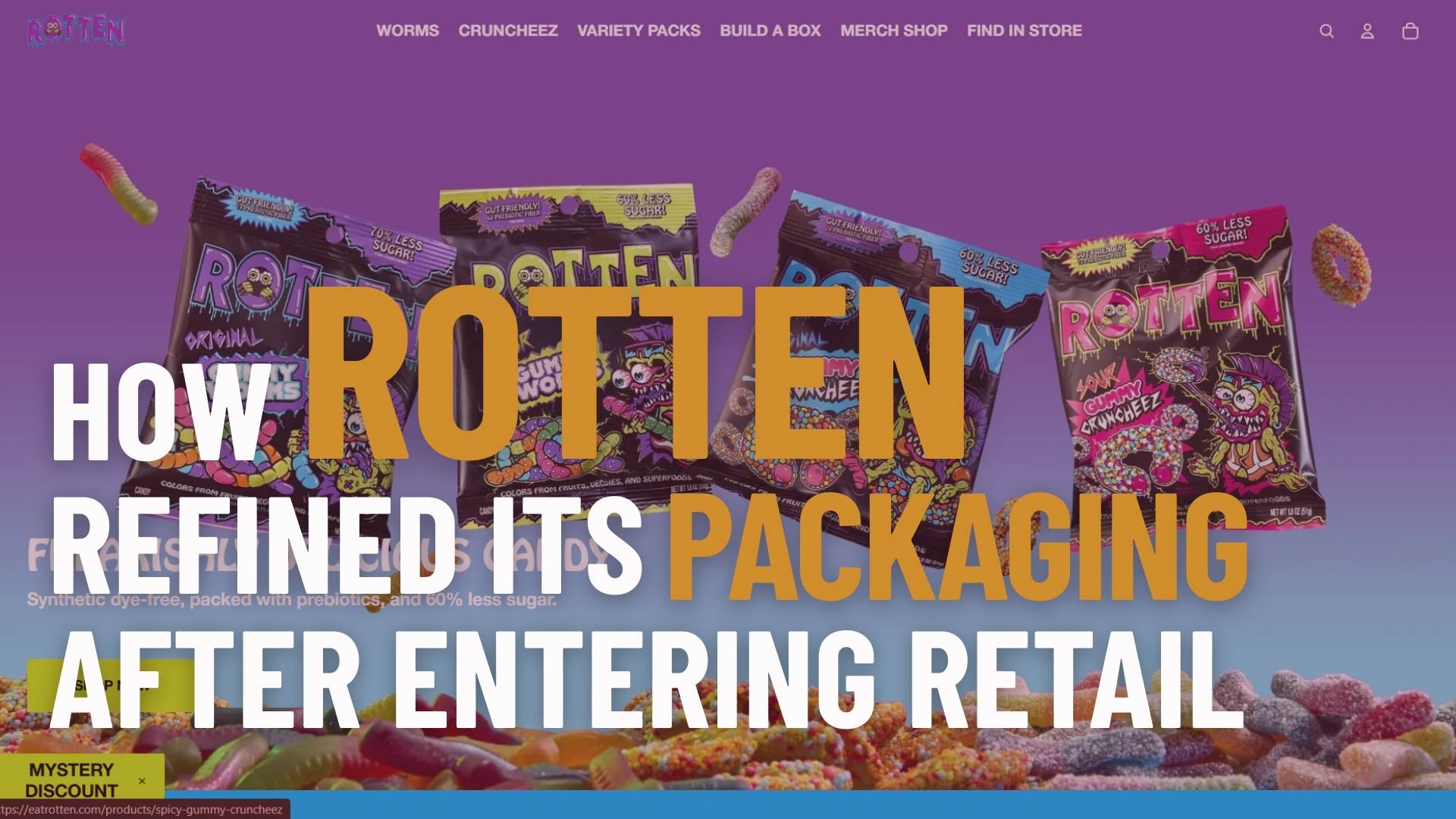
Rotten is a better-for-you gummy brand known for its bold and playful style. It uses fun, cheeky branding to stand out.
The brand was first created for online shoppers. It grew quickly through direct sales on its website, using eye-catching product photos, quirky illustrations, and graphics designed mainly for digital platforms to grab attention and show its personality.
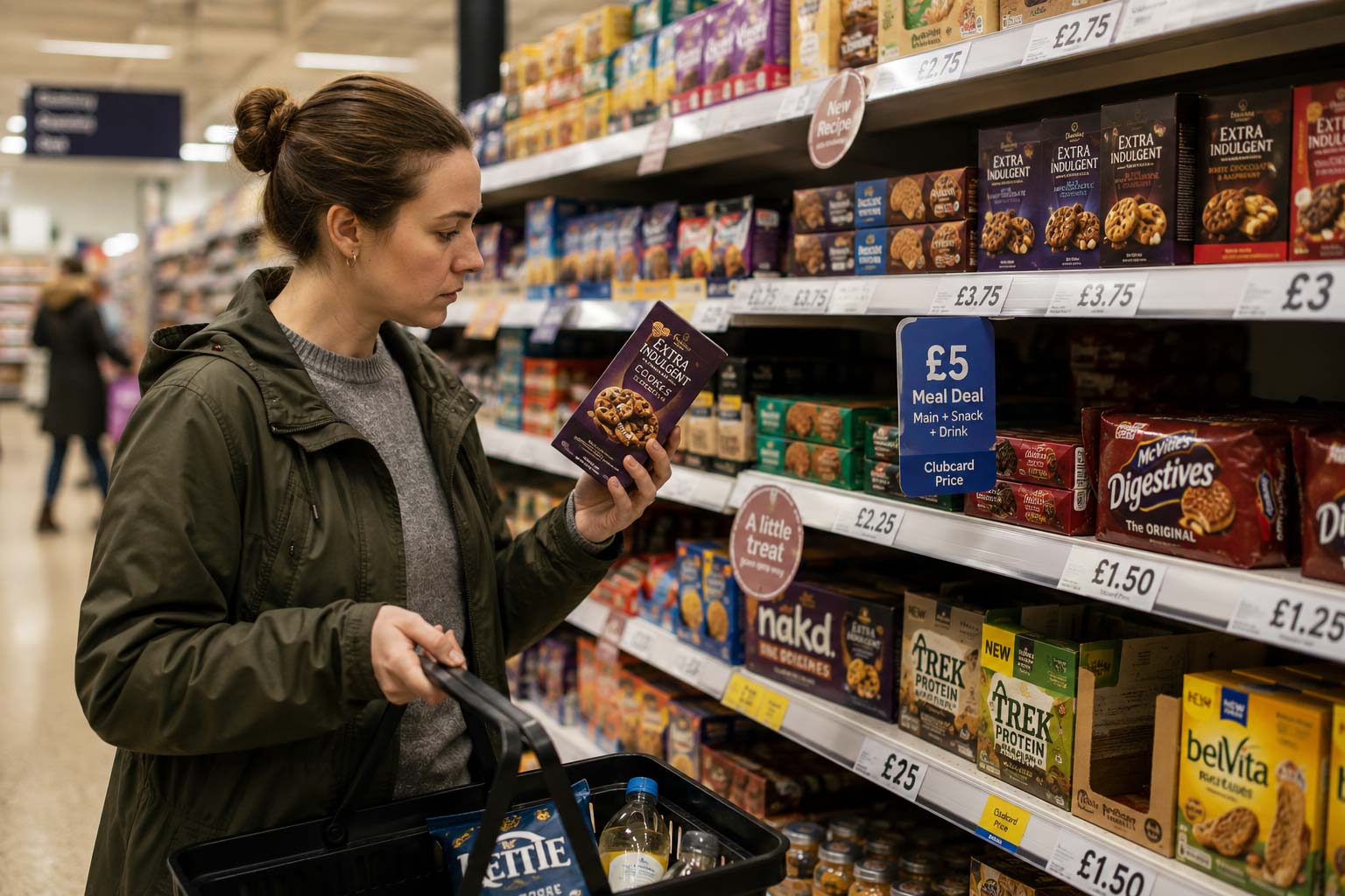
The transition to retail introduced new challenges. Designs that worked perfectly on screens didn’t always translate to crowded shelves, where shoppers make split-second decisions and rely on packaging to communicate flavour, health benefits, and quality instantly.
Misunderstanding of products and unclear messaging quickly revealed areas for improvement, showing that digital success doesn’t automatically guarantee retail performance.
The Shift From DTC to Retail
Direct-to-consumer (DTC) packaging is usually designed with screens in mind. It benefits from close viewing, scrolling, and time spent engaging with the brand.
DTC packaging often prioritises:
- Strong screen appeal for websites and social media
- Zoomed-in product photos that reward close inspection
- Detailed illustrations and textures
- Quirky, digital-first branding that performs well online
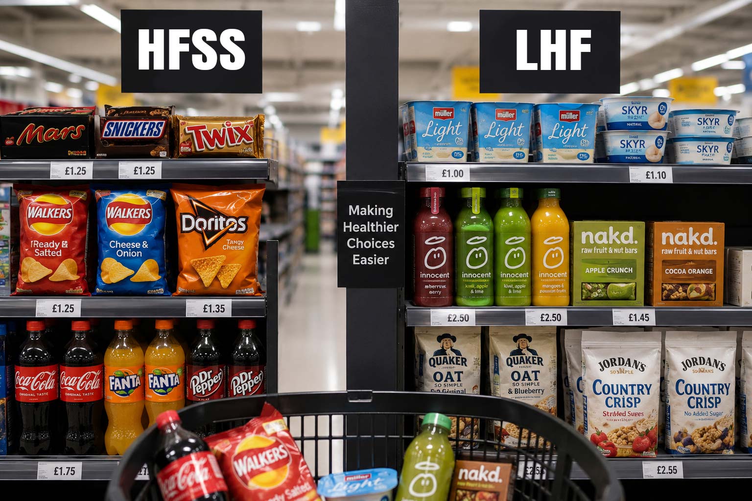
Retail environments demand a very different approach. Products are viewed quickly, at a distance, and alongside dozens of competitors.
In retail, packaging must account for:
- Distance-based readability on crowded shelves
- Rapid, split-second decision-making
- Heavy competition across SKUs, flavours, and colour systems
- Full reliance on the package to communicate value, flavour, and benefits
As Rudy Sanchez broadly observes, design eventually leaves the digital world and enters physical space. What works beautifully on a screen does not always translate once it becomes a printed object, stacked on shelves and seen several feet away. For brands moving into retail, that shift often exposes the gap between digital success and real-world performance.
The Problems That Emerged
Once Rotten entered retail, real-world feedback quickly exposed gaps between how the packaging looked online and how it performed on the shelf.
Customers Accidentally Choosing the Wrong Flavour
Even loyal fans of the brand were picking up the wrong variants in stores, which signalled that the visual hierarchy was not doing its job.
- Flavour differentiation was too subtle when products were viewed side by side
- Similar colour palettes across SKUs blended together on the shelf
- Key flavour cues required close inspection instead of quick recognition
In a retail setting, overly similar SKUs tend to collapse visually. What feels cohesive in a digital lineup can become confusing when shoppers scan quickly and rely on colour and contrast to decide.
Key Health Benefits Weren’t Obvious
Shoppers also questioned why Rotten was priced higher than conventional candy. The packaging did not clearly communicate the functional reasons behind the premium.
Key benefits that were not immediately clear included:
- Reduced sugar
- No artificial dyes
- Gut-friendly fibre
- Higher-quality, premium ingredients
In retail, functional benefits must be communicated instantly. Shoppers rarely pause to investigate or research. If the value is not obvious at a glance, price becomes the only comparison point.
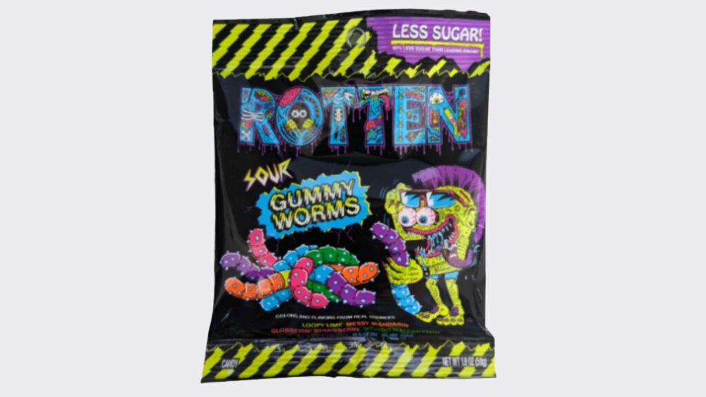
Legibility & Complexity Issues
Typography and visual detail also created friction on the shelf.
- Illustrated letterforms reduced contrast and readability at a distance
- Decorative details that looked expressive online became visual noise in-store
- Vibrant, digital-first patterns lost clarity when scaled to physical packaging
Together, these issues revealed a common retail lesson. Designs built for close viewing and storytelling on screens often need refinement to perform clearly, confidently, and quickly in a physical shopping environment.
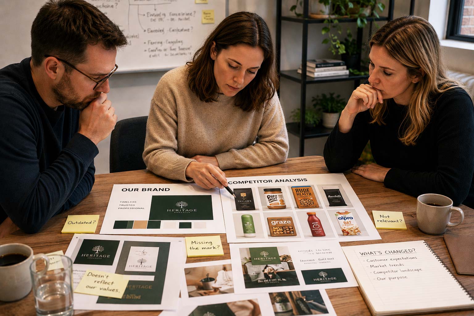
Rotten’s Collaborative Packaging Refresh
To address the issues uncovered in retail, Rotten worked closely with Los Angeles studio Destroy Design and designer Nick Nadeau. The refresh focused on clarity, differentiation, and stronger communication without losing the brand’s playful edge.
Logo Simplification
One of the first changes involved simplifying the logo.
- Illustration-heavy letterforms were removed
- Solid colours replaced intricate details
- Improved contrast increased legibility at shelf distance
This shift helped the logo read faster and more confidently in a crowded aisle.
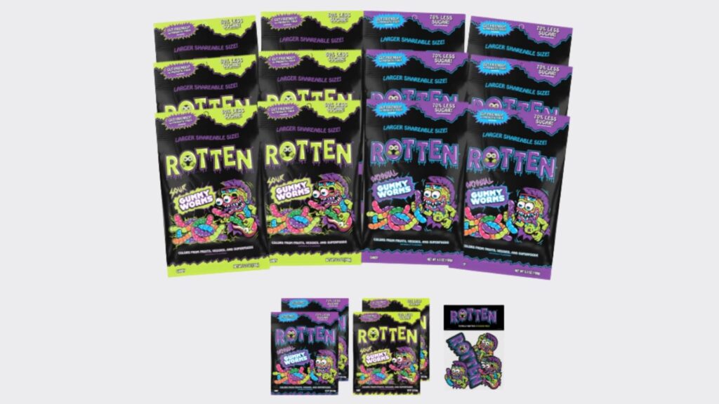
Strong Flavour Differentiation
Flavour confusion was tackled through a clearer colour system.
- Each flavour was assigned a bold, distinct colour
- Unified top and bottom bars reinforced visual consistency
- Logo colours matched flavour cues to strengthen SKU separation
The result made it easier for shoppers to spot and grab the correct variant quickly.
More Effective Health Messaging
Rotten brought functional benefits to the front of the pack instead of burying them in fine print.
Key callouts now include:
- “60% less sugar”
- “No artificial dyes”
- “Contains gut-friendly fibre”
Simple icons and clear callouts support fast shopper understanding and justify the premium price point at a glance.
Material Finish Upgrade
The packaging finish also received an update.
- Shifted to a matte finish
- Elevated the perceived quality of the product
- Better aligned with modern CPG shelf aesthetics
This change helped the brand feel more intentional and premium in-store.
Expanding Brand Lore
The refresh also created space to build narrative depth.
- Introduction of Dr Rotten’s backstory
- Stronger mascot presence across the packaging
Mascots and storytelling improve brand memory by giving consumers a character and personality to connect with, helping Rotten stand out beyond flavour and function alone.
The Results and Market Response
The packaging updates delivered immediate, measurable improvements once Rotten’s refreshed products returned to shelves.
Increased Clarity & Fewer Shopper Mistakes
After the packaging refresh, customers could easily tell flavours apart. Bold colours and a simplified logo made it quicker to identify the right variant, reducing mis-purchases on the shelf.
Clearer Health Messaging
Front-of-pack claims like “60% less sugar,” “no artificial dyes,” and “contains gut-friendly fibre” helped shoppers see the benefits immediately. Customer reviews started mentioning these points, showing the message was understood.
More Premium Perception in Aisles
Switching to a matte finish and simplifying graphics made the product look higher quality. The design felt more modern and premium while still keeping the brand’s fun personality.
Validation of Small Tweaks
Founder Michael Fisher noted that small tweaks added up. Adjustments to colour, logo, messaging, and finish made a big difference in how shoppers saw the product and how they engaged with it.
Before & After Visual Breakdown
Before
- Illustrated typography
- Glossy finish
- Yellow/black striped accents
- Flavours sharing similar backgrounds
- Health benefits bear uried visually
After
- Clean, solid-colour logo
- Matte finish
- Clear, colour-coded flavours
- Loud, enlarged health claims
- More focused visual hierarchy
Work With a Packaging Designer in the UK
Moving into retail is a major shift. What performs well online can struggle once it sits on a crowded shelf. Clarity, hierarchy, colour systems, and material finishes all play a critical role in how fast shoppers understand your product.
If your brand is preparing for retail expansion or struggling with shelf performance, Goulding Media can help. As an experienced packaging designer in the UK, we specialise in refining DTC brands for real-world retail environments.
We focus on:
- Clear visual hierarchy for fast shelf readability
- Strong SKU differentiation across flavours and variants
- Bold, benefit-led front-of-pack messaging
- Premium material and finish recommendations
- Retail-ready design systems that scale
At Goulding Media, we combine strategy, branding, and commercial insight to create packaging that not only looks great but performs where it matters most, in-store.
If you are ready to strengthen your retail presence, partner with a packaging designer in the UK who understands both digital growth and physical shelf impact. Let’s build packaging that sells.
Wrapping Up
Rotten’s move from DTC to retail shows how packaging that works online doesn’t always translate to crowded store shelves. Their original designs caused some confusion, with mis-purchases, unclear health messaging, and legibility issues revealing the limits of screen-focused visuals.
But Rotten simplified the logo, introduced bold, colour-coded flavours, highlighted key health benefits, switched to a matte finish, and added storytelling through Dr Rotten’s backstory.
These changes reduced shopper mistakes, made functional benefits clear at a glance, and gave the brand a more premium feel, proving that small, thoughtful tweaks can make a big difference.