Did you know that 81% of consumers have bought a new product because the packaging caught their eye? In a sea of options on retail shelves, your packaging is often the first—and sometimes only—chance to make an impression.
Packaging fonts are the silent persuaders of design. They communicate personality, quality, and trustworthiness long before a customer reads a single word. The wrong typeface can make a premium product feel cheap, while the right one can instantly elevate your brand.
In this guide, you’ll discover more than just “pretty fonts.” You’ll learn how to choose typography that aligns with your brand, resonates with your target audience, and actually boosts sales.
Benefits of Great Typography in Packaging: The Power of Font Psychology
When you’re selling a product on a crowded shelf, your packaging has to do the talking before you ever get the chance. Packaging fonts are little signals that instantly tell customers what your brand is all about. Pick the right one, and people “get” your product at a glance. Pick the wrong one, and you might send the wrong message.
- Serif = Tradition & Luxury: Use serif fonts if you want to signal heritage, craftsmanship, or premium quality. Example: a fine wine label often uses serif fonts to look high-end.
- Sans Serif = Modern & Clean: These fonts feel simple, fresh, and trustworthy. Example: organic baby food brands use sans serif to show health, honesty, and transparency.
- Script = Personal & Elegant: Script fonts resemble handwriting, making packaging feel personal and special. Example: a chocolate box with a script exudes a handcrafted, elegant vibe.
- Display = Bold & Creative: Display fonts are designed to grab attention fast. They work for playful, unique brands that want to stand out—like craft sodas with quirky lettering.
Your font choice is basically your product’s voice. It sets the tone before a customer even touches the package. Fonts tell shoppers if your product is luxurious, trustworthy, personal, or fun—and that can be the difference between being noticed or ignored on a busy shelf.
How to Choose the Right Packaging Font
1. Start With Your Brand Personality
Ask yourself: What do I want customers to feel when they see my packaging?
- Luxury & heritage: Serif fonts like Garamond or Didot give off tradition and class.
- Clean & modern: Sans serifs like Aileron or Maison Neue feel fresh and simple.
- Playful & creative: Hand-drawn or display fonts like Huge Night or Beloved grab attention.
- Personal & elegant: Script fonts like Lucia Script or Southelia feel warm and special.
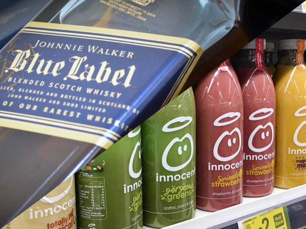
Example: Johnnie Walker whiskey uses refined serif fonts to show heritage and craftsmanship, while Innocent Drinks goes with rounded sans serif fonts to look fun, approachable, and natural.
2. Consider Your Target Audience
Different groups respond to different styles:
- Younger audiences: Bold, modern, quirky fonts.
- Professional buyers (cosmetics, luxury goods): Refined serifs or elegant scripts.
- Health-conscious consumers: Clean, minimalist sans serifs.
3. Prioritise Readability
If customers can’t read your label quickly, you’ve lost them.
- Use clear sans serifs for small text (ingredients, nutritional info).
- Save decorative fonts for logos or headlines only.
Example: Kellogg’s UK cereal boxes use a big, bold display font for the logo, but the nutritional panel is kept simple in a clean sans serif.
4. Think About Font Pairing
Pair fonts to create hierarchy and balance:
- Logo/product name: Expressive or distinctive font.
- Supporting info: Neutral, easy-to-read sans serif.
- Tagline/description: A lighter script or serif for contrast.
Example: The Body Shop could use a serif font like Didot for the logo to feel premium, Helvetica (sans serif) for product details, and a subtle script for a tagline to add softness.
5. Test in Real Context
Fonts can look different in real life compared to on your computer. Always test:
- Shelf visibility: Can people read it from a distance?
- Print clarity: Does it stay sharp in small print?
- Brand consistency: Does it match your logo, colours, and tone?
Example: Charlotte Tilbury’s bold serif logo looks powerful online and in-store, but if used too heavily on small packaging, it could overwhelm, so supporting fonts are kept clean and light.
Best Fonts for Packaging in 2025
Now that you understand how fonts influence perception and how to choose them, let’s look at specific fonts trending for UK packaging this year.
Serif Fonts – Elegant & Traditional
Serif fonts have decorative strokes at the ends of letters. They signal heritage, tradition, and sophistication, making them ideal for products that want to appear premium or timeless.
1. Garamond
- Font Psychology: Classic and trustworthy, projecting craftsmanship.
- Best For: Luxury items like wines, fine jewellery, and traditional foods.
- Example: Often found on wine labels to communicate sophistication.
2. Didot
- Font Psychology: High contrast and dramatic elegance — luxury at a glance.
- Best For: Fashion, fragrances, and cosmetics.
- Example: Used by Giorgio Armani to signal high-class refinement.
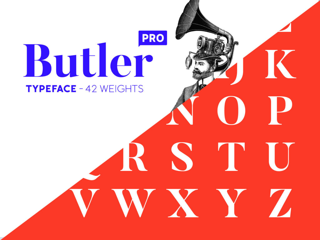
3. Butler
- Font Psychology: A modern twist on serif fonts, balancing elegance and boldness.
- Best For: Premium snacks, gourmet foods, boutique drinks.
- Example: A peanut butter brand could use it to feel indulgent yet modern.
Sans Serif Fonts – Modern & Clean
Sans serif fonts lack decorative strokes, giving them a streamlined, contemporary feel. They’re versatile and suit brands aiming for minimalism, clarity, and approachability.
4. Maison Neue
- Font Psychology: Minimalist, contemporary, and versatile. Suggests quality without fuss.
- Best For: Whiskey bottles, skincare packaging, tech-inspired products.
- Example: Works well on sleek whiskey labels where elegance meets readability.
5. Sofia
- Font Psychology: Rounded and approachable. Evokes friendliness and comfort.
- Best For: Coffee packaging, baby care products, organic food lines.
- Example: Coffee roasters use Sofia to balance artisanal charm with readability.
6. Omnes
- Font Psychology: Playful but clean. Rounded shapes make it approachable and energetic.
- Best For: Snacks, beverages, and children’s foods.
- Example: A juice brand could use Omnes for bright, fun shelf appeal.
Script Fonts – Personal & Premium
Script fonts mimic handwriting or calligraphy, creating a sense of personality, romance, and exclusivity. They’re ideal for brands that want to feel intimate or luxurious.
7. Lucia Script
- Font Psychology: Elegant, calligraphic style adds romance and exclusivity.
- Best For: Luxury wine bottles, high-end chocolates, artisan brands.
- Example: A luxury winery might pair Lucia Script with gold foiling for maximum impact.
8. Satisfy
- Font Psychology: Casual yet sophisticated, brush script with personality.
- Best For: Pastries, artisanal snacks, café packaging.
- Example: A bakery using Satisfy on cookie boxes signals homemade quality.
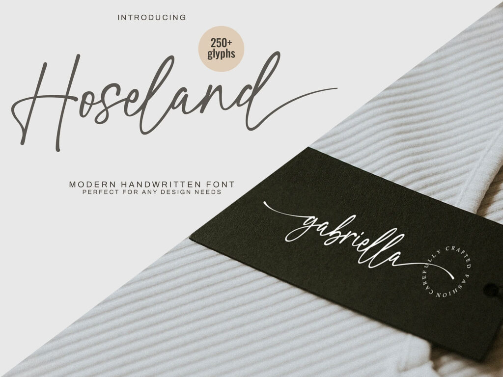
9. Hoseland / Southelia
- Font Psychology: Smooth, graceful, and upscale. Suggests elegance with warmth.
- Best For: Cosmetics, perfumes, boutique personal care.
- Example: A luxury skincare line could use Southelia for its logo to reinforce trust and refinement.
Display & Creative Fonts – Bold & Attention-Grabbing
Display fonts are designed to stand out and catch the eye. Unlike body text fonts, they are meant for headlines, logos, or packaging elements where impact matters more than readability. These bold fonts for packaging often convey energy, creativity, or niche personality, making them ideal for products targeting younger, trend-conscious, or artistic audiences.
10. Huge Night
- Font Psychology: Playful and energetic, it demands attention instantly.
- Best For: Kid snacks, fun beverages, festival-themed packaging.
- Example: A candy brand can use Huge Night for bold, exciting wrappers.
11. Shock Force / Blazone
- Font Psychology: Graffiti-inspired, raw, and urban. Appeals to younger, edgy audiences.
- Best For: Energy drinks, streetwear merchandise, and alternative food products.
- Example: Blazone with distressed textures works well on craft beer cans.
12. Kouva Glorin
- Font Psychology: Experimental, artistic, and niche. Perfect for boutique brands.
- Best For: Artisanal goods, creative startups, and handmade products.
- Example: A boutique candle brand could use Kouva Glorin for unconventional appeal.
Font Pairing Ideas for Packaging
Once you’ve selected your fonts, pairing them effectively can elevate your design. Thoughtful pairings create visual hierarchy and tell a richer brand story. Here’s how to match fonts for different product types.
1. Luxury Food & Beverage
- Header: Didot (serif, luxury, timeless)
- Body: Sofia (sans serif, clean and modern)
Didot communicates exclusivity while Sofia ensures ingredient lists and details stay legible. Great for wine, olive oil, or artisanal chocolate.
2. Organic & Family-Friendly Products
- Header: Lucia Script (script, warm and personal)
- Body: Omnes (sans serif, approachable and round)
Lucia Script feels handcrafted, while Omnes adds clarity. Perfect for baby food, organic snacks, or wellness products.
3. Trendy Cosmetics or Skincare
- Header: Butler (modern serif, stylish sophistication)
- Body: Maison Neue (sans serif, sleek and minimal)
Butler adds flair without being overpowering, while Maison Neue balances it with clean professionalism. Ideal for skincare jars, makeup palettes, or perfumes.
4. Playful Snacks & Youth Brands
- Header: Huge Night (bold display, fun and loud)
- Body: Sofia (sans serif, simple and friendly)
Huge Night grabs attention on shelves, while Sofia keeps nutrition info and brand copy clear. Best for chips, soda, or candy.
5. Artisan & Craft Products
- Header: Hoseland (script, elegant and stylish)
- Body: Garamond (serif, heritage and trust)
Hoseland feels premium and intimate, while Garamond adds credibility. Works beautifully for handmade soaps, speciality teas, or craft spirits.
Common Mistakes to Avoid in Packaging Font Choice
Even experienced designers make mistakes. Knowing what to avoid ensures your typography reinforces your brand instead of undermining it.
1. Using Too Many Fonts
One of the most common mistakes in packaging design is mixing too many fonts. While variety may seem creative, it often creates clutter and confusion. Stick to two fonts — one for headings and one for body text — to maintain a balanced and professional design.
2. Prioritising Style Over Readability
A font may look stylish on screen but end up unreadable on a package, especially at small sizes. If customers can’t easily read your product name or details, they’ll move on. Always test your fonts on mockups and in real packaging sizes to ensure legibility.
3. Ignoring Brand Personality
Fonts carry emotional weight, and picking one that doesn’t match your brand can send the wrong message. For example, a playful display font on luxury skincare packaging would feel out of place. Select fonts that align with your brand’s values and audience expectations.
4. Overusing Script Fonts
Script fonts are elegant, but when used for body text or lengthy descriptions, they become hard to read. Keep script fonts for short, eye-catching text, such as logos, product names, or headers, and balance them with a simple, supporting font.
5. Not Considering Cultural or Market Context
Fonts don’t look the same to everyone. What feels premium in one culture might look outdated or overly formal in another. Research your target market before finalising a font, especially if your product is sold internationally.
6. Forgetting About Contrast
Fonts need to work well with background colours and textures. A thin, light font on a busy, patterned background will get lost. Always check the colour contrast and weight so your text stands out while staying consistent with the design.
Suppose you want packaging that avoids these common pitfalls and truly connects with your customers, partner with Goulding Media, a UK-based packaging design expert. We create custom packaging fonts and layouts that captivate your audience and turn shelf visibility into real sales.
Trends in Typography for Packaging for 2025
Sustainability = Minimalist Sans Serif
Eco-conscious brands continue to favour minimalist sans-serif fonts. Clean lines and straightforward typography reinforce transparency and sustainability, often paired with recycled or uncoated materials to give a natural feel. Fonts like Helvetica Neue or Avenir are common choices for organic food, eco-friendly cleaning products, and sustainable fashion packaging.
Luxury Brands = Bold Serif Revival
Luxury packaging is moving back to bold serif fonts that communicate heritage, authority, and elegance. Serif typefaces with strong contrasts, such as Didot or Playfair Display, are being used by wine, jewellery, and premium skincare brands to stand out on shelves and reinforce exclusivity.
DTC Brands = Quirky Display Fonts
Direct-to-consumer brands thrive on personality, and many are adopting playful display fonts to create a sense of uniqueness. These font styles for packaging are unconventional, often colourful or hand-drawn, and they connect with younger audiences who value individuality. Examples include snack startups, beverage brands, and lifestyle products targeting the Gen Z demographic.
Digital-Native Packaging = AR/NFC Readability
As more brands integrate QR codes, AR, and NFC tags on their packaging, typography must remain functional across all digital interactions. Clear, legible sans-serif fonts, such as Roboto or Open Sans, are paired with tech-friendly layouts, ensuring text remains scannable on screens while maintaining a modern, digital-first aesthetic.
Wrapping Up
Packaging fonts shape perception, influence choices, and drive sales. The right typeface communicates your brand’s story instantly, whether it’s playful, premium, approachable, or trustworthy. Choosing the wrong font can dilute your message and make your product blend into a crowded shelf.