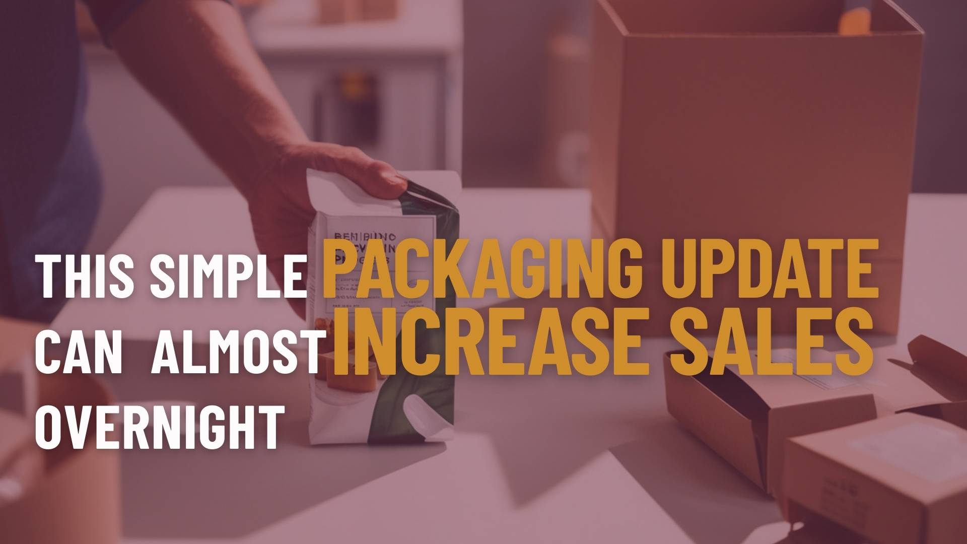
Small, strategic updates to packaging can deliver significant results. Adjusting colours, typography, finishes, or functional features helps products stand out on crowded shelves, enhance the unboxing experience, and communicate quality or sustainability—all without a complete redesign.
These subtle changes can boost visibility, strengthen consumer perception, and drive measurable sales increases almost immediately, demonstrating that packaging is not just a protective layer but a powerful lever for growth and market impact.
Try These Simple Packaging Updates
Colour and visual tweaks to stand out on shelves and online
Even subtle adjustments to colour contrast, accent shades, or product imagery can dramatically improve visibility. Brightening key elements, updating outdated hues, or adding highlights creates a stronger shelf presence and improves online thumbnail performance.
Consider aligning colours with seasonal trends, using high-contrast elements for impulse purchases, or introducing small visual motifs that signal product benefits. These tweaks help the product capture attention quickly in crowded retail environments and digital marketplaces.
Discover how smart colour choices can transform product visibility and boost conversions. Read more about our article on packaging colours.
Typography and messaging adjustments to clarify benefits or key features
Text is often the first interaction consumers have with a product. Refining labels—simplifying copy, emphasising a unique selling point, or clarifying usage instructions—reduces confusion and increases purchase confidence.
Highlighting core benefits with hierarchy, bold fonts, or callouts ensures that the most important information is instantly noticeable. Even minor shifts in wording or font style can make products feel more modern, trustworthy, and aligned with evolving consumer expectations.
Learn how strategic typography can strengthen clarity and influence buying decisions. Read more about our article on packaging font styles.
Premium finishes like matte coatings, foil, or embossing to enhance perceived value
Adding tactile or visual finishes elevates the product’s perception. Matte coatings, foil stamping, spot gloss, or embossing make the packaging feel more luxurious and high-quality, reinforcing brand value and appealing to premium-seeking consumers.
Explore how premium finishes can elevate brand perception and justify higher price points. Read more about our article on packaging finishes.
Functional enhancements: resealable packaging, easier opening, protective inserts
Small improvements in usability directly impact the customer experience. Features like resealable pouches, tear strips, anti-spill designs, or protective inserts reduce frustration and product waste, making repeat purchases more likely.
Functional updates also convey that the brand understands consumer needs, enhancing trust and satisfaction without a full redesign.
Sustainability indicators to meet modern consumer expectations
Highlighting eco-friendly aspects—such as recyclable materials, reduced plastic use, or post-consumer waste content—can strengthen brand trust. Even minor updates that communicate sustainability show that the brand is aligned with modern values, resonating with environmentally conscious shoppers.
Understand how sustainable packaging signals can influence purchasing behaviour and brand trust. Read more about our article on packaging sustainability.
Ensuring consistency across retail, e-commerce, and unboxing experiences
Packaging should feel cohesive, no matter where the consumer encounters it. From store shelves to online thumbnails to the unboxing experience at home, consistent colours, typography, and messaging reinforce brand recognition and create a polished, professional impression.
Because these changes are incremental rather than structural, they can often be rolled out quickly without major production delays or cost overruns. The result is a fast, measurable lift in sales, brand perception, and consumer engagement, making it a highly efficient strategy for large companies.
Steps to Execute a Simple Yet Powerful Packaging Update
1. Define Goals and Success Metrics
Before making any changes, clarify what you want the update to achieve. Are you aiming for a measurable sales lift, stronger shelf presence, improved brand perception, or increased digital engagement? Defining clear objectives ensures every design decision is purposeful and that you can measure the impact after implementation.
2. Audit Existing Packaging
Conduct a thorough review of your current packaging across all channels—retail, e-commerce, and unboxing. Identify outdated visual elements, unclear messaging, or functional pain points. Look for small areas where tweaks can deliver high impact without overhauling the whole design. This audit sets the foundation for targeted, strategic updates.
3. Consumer & Internal Feedback
Gather insights from customers, employees, and stakeholders. Use surveys, focus groups, or A/B testing to determine what resonates visually, functionally, and emotionally. Understanding consumer preferences and internal priorities helps validate design choices and ensures updates enhance usability and appeal.
4. Select Strategic Design Changes
Choose updates that are high-impact yet low-disruption. This can include:
- Adjusting colours or contrast for better shelf visibility
- Adding premium finishes like matte coatings, foil, or embossing
- Updating icons or messaging hierarchy to clarify benefits
- Making small functional enhancements, such as resealable packaging
5. Pilot & Measure
Before a full-scale rollout, test the updates in select markets or channels. Monitor KPIs like sales performance, online click-through rates, or social media engagement. Gather feedback, refine any elements that underperform, and then expand to a full-scale implementation. Piloting ensures the update delivers the intended impact and reduces risk.
Case Examples of Incremental Impact
Millions Sweets
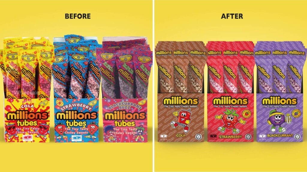
Millions, known for its colourful, chewy sweets, faced the challenge of staying relevant with younger, trend-savvy consumers while appealing to nostalgic shoppers. A subtle packaging refresh modernised the iconic characters, standardised typography and taglines, and introduced highlight icons emphasising real fruit juice and no artificial colours. Vibrant watermark patterns added depth without compromising the playful tone.
Impact: After the update, Millions reported stronger shelf presence, increased social media engagement, and a noticeable uptick in purchase intent among younger demographics while retaining brand loyalty from existing fans.
Curious how a playful classic captured a new generation without losing its loyal fans? Read on to discover how we revitalised Millions’ packaging, sharpened its shelf impact, and balanced nostalgia with modern appeal to drive stronger engagement and purchase intent.
Butcher’s Natural Health Solutions
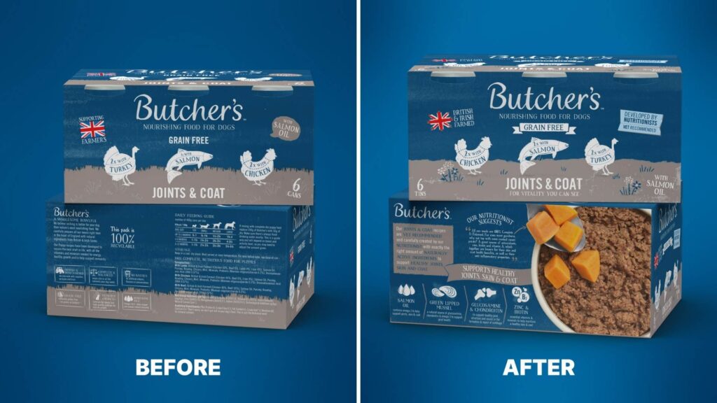
The redesign of Butcher’s Natural Health Support range strengthened its health positioning while retaining core brand recognition. Familiar Butcher’s cues were kept to protect brand equity, but clearer benefit-led messaging, stronger on-pack credentials and a more clinical stamp device helped signal a step up in functional value. Improved ingredient storytelling and quality photography reinforced trust and supported the premium health proposition.
Crucially, the range was clearly differentiated from the core line without feeling disconnected. The visual system created a distinct sub-range architecture that justified a higher price point and appealed to health-conscious pet owners. This clarity on shelf, combined with consistent roll-out across formats, helped establish the range as a credible, high-performing extension of the brand.
Look how we refined the Butcher’s Natural Health Solutions packaging architecture, strengthened benefit messaging, and built a clearer, more credible presence that justified a higher price point.
Good Vibes Tea
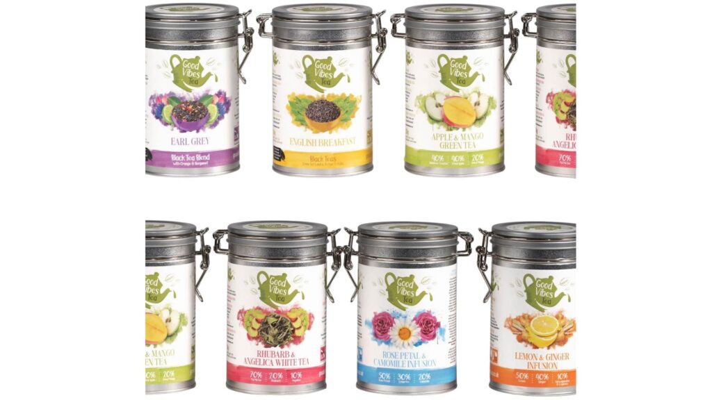
Good Vibes Tea aimed to combine premium appeal with sustainability. Packaging updates included reusable metal containers, peelable, recyclable labels, and intricate, colour-rich illustrations for each tea variety. Functional elements, such as clear usage instructions and prominent sustainability messaging, enhanced both usability and brand storytelling.
Impact: The update improved customer engagement online and in-store, boosted perceived product value, and contributed to higher repeat purchase rates. The sustainable design also resonated with eco-conscious consumers, strengthening brand loyalty.
Interested in how premium design and sustainability can work seamlessly together? Read on to learn how we transformed Good Vibes Tea’s packaging with reusable formats, richer storytelling, and stronger eco messaging that increased perceived value and encouraged repeat purchases.
Wrapping Up
Small, targeted packaging updates can transform how products are perceived and purchased—without needing a full redesign. Adjusting visuals, messaging, finishes, or functionality can make a product instantly stand out on crowded shelves, appeal to modern consumers, and reinforce brand value. It’s all about sharpening your message and creating clarity within your claims.
If you’re ready to unlock the full potential of your packaging, Goulding Media, UK’s expert packaging designers, can help you identify high-impact updates and bring them to life across retail, e-commerce, and unboxing experiences.
Contact us today to start transforming your packaging into a strategic growth lever.